 Web
and Book design image, Web
and Book design image,Copyright, Kellscraft Studio 1999-2016 (Return to Web Text-ures) |
 (HOME)
|
|
A SHORT HISTORY AND
DESCRIPTION OF THE KELMSCOTT PRESS.
The foregoing
article was written at the request of a London bookseller for
an American client who was about to read a paper on the Kelmscott
Press. As the
Press is now closing, and its seven years' existence will soon be a
matter of
history, it seems fitting to set down some other facts concerning it
while they
can still be verified; the more so as statements founded on imperfect
information have appeared from time to time in newspapers and reviews. As early as 1866
an edition of The Earthly Paradise was projected, which
was to have been a folio in double columns, profusely illustrated by
Sir Edward
Burne-Jones, and typographically superior to the books of that Art and Craft of
Printing,
by William Morris 3 time. The
designs for the stories of Cupid and Psyche, Pygmalion and the
Image, The Ring given to Venus, and the Hill of Venus, were finished,
and
forty-four of those for Cupid and Psyche were engraved on wood in line,
somewhat in the manner of the early German masters. About thirty-five
of the
blocks were executed by William Morris himself, and the remainder by
George Y.
Wardle, G. F. Campfield, C. J. Faulkner, and Miss Elizabeth Burden.
Specimen
pages were set up in Caslon type, and in the Chiswick Press type
afterwards
used in The House of the Wolfings, but for various reasons the project
went no
further. Four or five years later there was a plan for an illustrated
edition
of Love is Enough, for which two initial L's and seven side ornaments
were
drawn and engraved by William Morris. Another marginal ornament was
engraved by
him from a design by Sir E. Burne-Jones, who also drew a picture for
the
frontispiece, which has now been engraved by W. H. Hooper for the final
page of
the Kelmscott Press edition of the work. These side ornaments, three of
which
appear on the opposite page, are more delicate than any that were
designed for
the Kelmscott Press, but they show that when the Press was started the
idea of
reviving some of the decorative features of the earliest printed books
had been
long in its founder's mind. At this same period, in the early
seventies, he was
much absorbed in the study of ancient manuscripts, and in writing out
and
illuminating various books, including a Horace and an Omar Khayyám,
which may
have led his thoughts away from printing. In any case, the plan of an
illustrated Love is Enough, like that of the folio Earthly Paradise,
was abandoned. Although the
books written by William Morris continued to be reasonably
printed, it was not until about 1888 that he again paid much attention
to
typography. He was then, and for the rest of his life, when not away
from Hammersmith,
in daily communication with his friend and neighbour Emery Walker,
whose views
on the subject coincided with his own, and who had besides a practical
knowledge of the technique of printing. These views were first
expressed in an
article by Mr. Walker in the catalogue of the exhibition of the Arts
and Crafts
Exhibition Society, held at the New Gallery in the autumn of 1888. As a
result
of many conversations, The House of the Wolfings was printed at the
Chiswick
Press at this time, with a special type modelled on an old Basel fount,
unleaded, and with due regard to proportion in the margins. The
title-page was
also carefully arranged. In the following year The Roots of the
Mountains was
printed with the same type (except the lower case e), but with a
differently
proportioned page, and with shoulder-notes instead of head-lines. This
book was
published in November, 1889, and its author declared it to be the
best-looking
book issued since the seventeenth century. Instead of large paper
copies, which
had been found unsatisfactory in the case of The House of the Wolfings,
two
hundred and fifty copies were printed on Whatman paper of about the
same size as
the paper of the ordinary copies. A small stock of this paper remained
over,
and in order to dispose of it seventy-five copies of the translation of
the
Gunnlaug Saga, which first appeared in the Fortnightly Review of
January, 1869,
and afterwards in Three Northern Love Stories, were printed at the
Chiswick
Press. The type used was a black-letter copied from one of Caxton's
founts, and
the initials were left blank to be rubricated by hand. Three copies
were
printed on vellum. This little book was not however finished until
November,
1890.
Meanwhile
William Morris had resolved to design a type of his own.
Immediately after The Roots of the Mountains appeared, he set to work
upon it,
and in December, 1889, he asked Mr. Walker to go into partnership with
him as a
printer. This offer was declined by Mr. Walker; but, though not
concerned with
the financial side of the enterprise, he was virtually a partner in the
Kelmscott Press from its first beginnings to its end, and no important
step was
taken without his advice and approval. Indeed, the original intention
was to have
the books set up in Hammersmith and printed at his office in Clifford's
Inn. It
was at this time that William Morris began to collect the mediæval
books of
which he formed so fine a library in the next six years. He had made a
small
collection of such books years before, but had parted with most of
them, to his
great regret. He now bought with the definite purpose of studying the
type and
methods of the early printers. Among the first books so acquired was a
copy of
Leonard of Arezzo's History of Florence, printed at Venice by Jacobus
Rubeus in
1476, in a Roman type very similar to that of Nicholas Jenson. Parts of
this
book and of Jenson's Pliny of 1476 were enlarged by photography in
order to
bring out more clearly the characteristics of the various letters; and
having
mastered both their virtues and defects, William Morris proceeded to
design the Art and Craft of
Printing, by William Morris 4 fount
of type
which, in the list of December, 1892,
he named the Golden type, from The Golden Legend, which was to have
been the
first book printed with it. This fount consists of eighty-one designs,
including stops, figures, and tied letters. The lower case alphabet was
finished in a few months. The first letter having been cut in Great
Primer size
by Mr. Prince, was thought too large, and 'English' was the size
resolved upon.
By the middle of August, 1890, eleven punches had been cut. At the end
of the
year the fount was all but complete. On Jan. 12th,
1891, a cottage, No. 16, Upper Mall, was taken. Mr.
William Bowden, a retired master-printer, had already been engaged to
act as
compositor and pressman. Enough type was then cast for a trial page,
which was
set up and printed on Saturday, Jan. 31st, on a sample of the paper
that was
being made for the Press by J. Batchelor and Son. About a fortnight
later ten
reams of paper were delivered. On Feb. 18th a good supply of type
followed. Mr.
W. H. Bowden, who subsequently became overseer, then joined his father
as compositor,
and the first chapters of The Glittering Plain were set up. The first
sheet
appears to have been printed on March 2nd, when the staff was increased
to
three by the addition of a pressman named Giles, who left as soon as
the book
was finished. A friend who saw William Morris on the day after the
printing of
the page above mentioned recalls his elation at the success of his new
type.
The first volume of the Saga Library, a creditable piece of printing,
was
brought out and put beside this trial page, which much more than held
its own.
The poet then declared his intention to set to work immediately on a
black-letter fount; illness, however, intervened and it was not begun
until
June. The lower case alphabet was finished by the beginning of August,
with the
exception of the tied letters, the designs for which, with those for
the
capitals, were sent to Mr. Prince on September 11th. Early in November
enough
type was cast for two trial pages, the one consisting of twenty-six
lines of
Chaucer's Franklin's Tale and the other of sixteen lines of Sigurd the
Volsung.
In each of these a capital I is used that was immediately discarded. On
the
last day of 1891 the full stock of Troy type was despatched from the
foundry.
Its first appearance was in a paragraph, announcing the book from which
it took
its name, in the list dated May, 1892. This Troy type,
which its designer preferred to either of the others,
shows the influence of the beautiful early types of Peter Schoeffer of
Mainz,
Gunther Zainer of Augsburg, and Anthony Koburger of Nuremberg; but,
even more
than the Golden type, it has a strong character of its own, which
differs
largely from that of any mediæval fount. It has recently been pirated
abroad,
and is advertised by an enterprising German firm as 'Die amerikanische
Triumph-Gothisch.' The Golden type has perhaps fared worse in being
remodelled
in the United States, whence, with much of its character lost, it has
found its
way back to England under the names 'Venetian,' 'Italian,' and
'Jenson.' It is
strange that no one has yet had the good sense to have the actual type
of Nicholas
Jenson reproduced. The third type
used at the Kelmscott Press, called the 'Chaucer,'
differs from the Troy type only in size, being Pica instead of Great
Primer. It
was cut by Mr. Prince between February and May, 1892, and was ready in
June.
Its first appearance is in the list of chapters and glossary of The
Recuyell of
the Historyes of Troye, which was issued on November 24th, 1892. On June 2nd of
that year, William Morris wrote to Mr. Prince: 'I believe
in about three months' time I shall be ready with a new set of sketches
for a
fount of type on English body.' These sketches were not forthcoming;
but on
Nov. 5th, 1892, he bought a copy of Augustinus De Civitate Dei, printed
at the
Monastery of Subiaco near Rome by Sweynheym and Pannartz, with a rather
compressed type, which appears in only three known books. He at once
designed a
lower case alphabet on this model, but was not satisfied with it and
did not
have it cut. This was his last actual experiment in the designing of
type,
though he sometimes talked of designing a new fount, and of having the
Golden
type cut in a larger size. Next in
importance to the type are the initials, borders, and ornaments
designed by William Morris. The first book contains a single recto
border and
twenty different initials. In the next book, Poems by the Way, the
number of
different initials is fifty-nine. These early initials, many of which
were soon
discarded, are for the most part suggestive, like the first border, of
the
ornament in Italian manuscripts of the fifteenth century. In Art and Craft of
Printing,
by William Morris 5 Blunt's Love
Lyrics there are seven letters of a new alphabet, with
backgrounds of naturalesque grapes and vine leaves, the result of a
visit to
Beauvais, where the great porches are carved with vines, in August,
1891. From
that time onwards fresh designs were constantly added, the tendency
being
always towards larger foliage and lighter backgrounds, as the early
initials
were found to be sometimes too dark for the type. The total number of
initials
of various sizes designed for the Kelmscott Press, including a few that
were
engraved but never used, is three hundred and eighty-four. Of the
letter T
alone there are no less than thirty-four varieties. The total number
of different borders engraved for the Press, including
one that was not used, but excluding the three borders designed for The
Earthly
Paradise by R. Catterson-Smith, is fifty-seven. The first book to
contain a
marginal ornament, other than these full borders, was The Defence of
Guenevere,
which has a half-border on p. 74. There are two others in the preface
to The
Golden Legend. The Recuyell of the Historyes of Troye is the first book
in
which there is a profusion of such ornament. One hundred and eight
different designs
for marginal ornaments were engraved. Besides the above-named designs,
there
are seven frames for the pictures in The Glittering Plain, one frame
for those
in a projected edition of The House of the Wolfings, nineteen frames
for the
pictures in the Chaucer (one of which was not used in the book),
twenty-eight title-pages
and inscriptions, twenty-six large initial words for the Chaucer, seven
initial
words for The Well at the World's End and The Water of the Wondrous
Isles, four
line-endings, and three printer's marks, making a total of six hundred
and
forty-four designs by William Morris, drawn and engraved within seven
years.
All the initials and ornaments that recur were printed from
electrotypes, while
most of the title-pages and initial words were printed direct from the
wood.
The illustrations by Sir Edward Burne-Jones, Walter Crane, and C. M.
Gere were
also, with one or two exceptions, printed from the wood. The original
designs
by Sir E. Burne-Jones were nearly all in pencil, and were redrawn in
ink by R.
Catterson-Smith, and in a few cases by C. Fairfax Murray; they were
then
revised by the artist and transferred to the wood by means of
photography. The
twelve designs by A. J. Gaskin for Spenser's Shepheardes Calender, the
map in
The Sundering Flood, and the thirty-five reproductions in Some German
Woodcuts
of the Fifteenth Century, were printed from process blocks. All the wood
blocks for initials, ornaments, and illustrations, were
engraved by W. H. Hooper, C. E. Keates, and W. Spielmeyer, except the
twenty-three blocks for The Glittering Plain, which were engraved by A.
Leverett,
and a few of the earliest initials, engraved by G. F. Campfield. The
whole of
these wood blocks have been sent to the British Museum, and have been
accepted
with a condition that they shall not be reproduced or printed from for
the
space of a hundred years. The electrotypes have been destroyed. In
taking this
course, which was sanctioned by William Morris when the matter was
talked of
shortly before his death, the aim of the trustees has been to keep the
series
of Kelmscott Press books as a thing apart, and to prevent the designs
becoming
stale by constant repetition. Many of them have been stolen and
parodied in
America, but in this country they are fortunately copyright. The type
remains
in the hands of the trustees, and will be used for the printing of its
designer's works, should special editions be called for. Other books of
which
he would have approved may also be printed with it; the absence of
initials and
ornament will always distinguish them sufficiently from the books
printed at
the Kelmscott Press. The nature of
the English hand-made paper used at the Press has been
described by William Morris in the foregoing article. It was at first
supplied
in sheets of which the dimensions were sixteen inches by eleven. Each
sheet had
as a watermark a conventional primrose between the initials W. M. As
stated
above, The Golden Legend was to have been the first book put in hand,
but as
only two pages could have been printed at a time, and this would have
made it
very costly, paper of double the size was ordered for this work, and
The Story
of the Glittering Plain was begun instead. This book is a small quarto,
as are
its five immediate successors, each sheet being folded twice. The last
ream of
the smaller size of paper was used on The Order of Chivalry. All the
other
volumes of that series are printed in octavo, on paper of the double
size. For
the Chaucer a stouter and slightly larger paper was needed. This has
for its
watermark a Perch with a spray in its mouth. Many of the large quarto
books
were printed on this paper, of which the first two reams were delivered
in
February, 1893. Only one other size of paper was used at the Kelmscott
Press.
The watermark of this is an Art
and Craft of
Printing, by William Morris 6 Apple,
with the
initials W.
M., as in the other two watermarks. The books printed on this paper are
The Earthly
Paradise, The Floure and the Leafe, The Shepheardes Calender, and
Sigurd the
Volsung. The last-named is a folio, and the open book shows the size of
the
sheet, which is about eighteen inches by thirteen. The first supply of
this
Apple paper was delivered on March 15, 1895. Except in the
case of Blunt's Love Lyrics, The Nature of Gothic, Biblia
Innocentium, The Golden Legend, and The Book of Wisdom and Lies, a few
copies
of all the books were printed on vellum. The six copies of The
Glittering Plain
were printed on very fine vellum obtained from Rome, of which it was
impossible
to get a second supply as it was all required by the Vatican. The
vellum for
the other books, except for two or three copies of Poems by the Way,
which were
on the Roman vellum, was supplied by H. Band of Brentford, and by W. J.
Turney
& Co. of Stourbridge. There are three complete vellum sets in
existence,
and the extreme difficulty of completing a set after the copies are
scattered,
makes it unlikely that there will ever be a fourth. The black ink which
proved
most satisfactory, after that of more than one English firm had been
tried, was
obtained from Hanover. William Morris often spoke of making his own
ink, in
order to be certain of the ingredients, but his intention was never
carried
out. The binding of
the books in vellum and in half-holland was from the
first done by J. & J. Leighton. Most of the vellum used was white,
or
nearly so, but William Morris himself preferred it dark, and the skins
showing brown
hair-marks were reserved for the binding of his own copies of the
books. The
silk ties of four colours, red, blue, yellow, and green, were specially
woven
and dyed. In the following
section fifty-two works, in sixty-six volumes, are
described as having been printed at the Kelmscott Press, besides the
two pages
of Froissart's Chronicles. It is scarcely necessary to add that only
hand presses
have been used, of the type known as 'Albion.' In the early days there
was only
one press on which the books were printed, besides a small press for
taking
proofs. At the end of May, 1891, larger premises were taken at 14,
Upper Mall,
next door to the cottage already referred to, which was given up in
June. In November,
1891, a second press was bought, as The Golden Legend was not yet half
finished, and it seemed as though the last of its 1286 pages would
never be
reached. Three years later another small house was taken, No. 14 being
still
retained. This was No. 21, Upper Mall, overlooking the river, which
acted as a
reflector, so that there was an excellent light for printing. In
January, 1895,
a third press, specially made for the work, was set up here in order
that two
presses might be employed on the Chaucer. This press has already passed
into other
hands, and the little house, with its many associations, and its
pleasant
outlook towards Chiswick and Mortlake, is now being transformed into a
granary.
The last sheet printed there was that on which are the frontispiece and
title
of this book. 14, Upper Mall,
Hammersmith, January 4, 1898. AN ANNOTATED LIST OF ALL THE BOOKS PRINTED AT THE KELMSCOTT PRESS IN THE ORDER IN WHICH THEY WERE ISSUED. This book was
set up from Nos. 81-4 of the English Illustrated Magazine,
in which it first appeared; some of the chapter headings were
re-arranged, and
a few small corrections were made in the text. A trial page, the Art and Craft of
Printing,
by William Morris 7 first printed at
the Press, was struck off on January 31, 1891, but the
first sheet was not printed until about a month later. The border was
designed
in January of the same year, and engraved by W. H. Hooper. Mr. Morris
had four
of the vellum copies bound in green vellum, three of which he gave to
friends.
Only two copies on vellum were sold, at twelve and fifteen guineas.
This was
the only book with washleather ties. All the other vellum-bound books
have silk
ties, except Shelley's Poems and Hand and Soul, which have no ties. 2. POEMS BY THE
WAY. WRITTEN BY WILLIAM MORRIS. Small 4to. Golden type.
In black and red. Border 1. 300 paper copies at two guineas, 13 on
vellum at
about twelve guineas. Dated Sept. 24, issued Oct. 20, 1891. Sold by
Reeves
& Turner. Bound in stiff vellum. This was the
first book printed at the Kelmscott Press in two colours,
and the first book in which the smaller printer's mark appeared. After
The
Glittering Plain was finished, at the beginning of April, no printing
was done
until May 11. In the meanwhile the compositors were busy setting up the
early
sheets of The Golden Legend. The printing of Poems by the Way, which
its author
first thought of calling Flores Atramenti, was not begun until July.
The poems
in it were written at various times. In the manuscript, Hafbur and
Signy is
dated February 4, 1870; Hildebrand and Hillilel, March 1, 1871; and
Love's
Reward, Kelmscott, April 21, 1871. Meeting in Winter is a song from The
Story
of Orpheus, an unpublished poem intended for The Earthly Paradise. The
last
poem in the book, Goldilocks and Goldilocks, was written on May 20,
1891, for
the purpose of adding to the bulk of the volume, which was then being
prepared.
A few of the vellum covers were stained at Merton red, yellow, indigo,
and dark
green, but the experiment was not successful. 3. THE
LOVE-LYRICS AND SONGS OF PROTEUS BY WILFRID SCAWEN BLUNT WITH THE
LOVE-SONNETS OF PROTEUS BY THE SAME AUTHOR NOW REPRINTED IN THEIR FULL
TEXT WITH
MANY SONNETS OMITTED FROM THE EARLIER EDITIONS. LONDON MDCCCXCII. Small
4to.
Golden type. In black and red. Border 1. 300 paper copies at two
guineas, none
on vellum. Dated Jan. 26, issued Feb. 27, 1892. Sold by Reeves &
Turner.
Bound in stiff vellum. This is the only
book in which the initials are printed in red. This was
done by the author's wish. 4. THE NATURE OF
GOTHIC A CHAPTER OF THE STONES OF VENICE. BY JOHN
RUSKIN. With a preface by William Morris. Small 4to. Golden type.
Border 1.
Diagrams in text. 500 paper copies at thirty shillings, none on vellum.
Dated
in preface February 15, issued March 22, 1892. Published by George
Allen. Bound
in stiff vellum. This chapter of
the Stones of Venice, which Ruskin always considered the
most important in the book, was first printed separately in 1854 as a
sixpenny
pamphlet. Mr. Morris paid more than one tribute to it in Hopes and
Fears for
Art. Of him Ruskin said in 1887, 'Morris is beaten gold.' 5. THE DEFENCE
OF GUENEVERE, AND OTHER POEMS. BY WILLIAM MORRIS. Small
4to. Golden type. In black and red. Borders 2 and 1. 300 paper copies
at two
guineas, ten on vellum at about twelve guineas. Dated April 2, issued
May 19,
1892. Sold by Reeves & Turner. Bound in limp vellum. This book was
set up from a copy of the edition published by Reeves
& Turner in 1889, the only alteration, except a few corrections,
being in
the 11th line of Summer Dawn. It is divided into three parts, the poems
suggested
by Malory's Morte d'Arthur, the poems inspired by Froissart's
Chronicles, and
poems on various subjects. The two first sections have borders, and the
last
has a half-border. The first sheet was printed on February 17, 1892. It
was the
first book bound in limp vellum, and the only one of which the title
was inscribed
by hand on the back. 6. A DREAM OF
JOHN BALL AND A KING'S LESSON. BY WILLIAM MORRIS. Small
4to. Golden type. In black and red. Borders 3a, 4, and 2. With a
woodcut
designed by Sir E. Burne-Jones. 300 paper copies at thirty shillings,
eleven on
vellum at ten guineas. Dated May 13, issued Sept. 24, 1892. Sold by
Reeves
& Turner. Bound in limp vellum. This was set up
with a few alterations from a copy of Reeves &
Turner's third edition, and the printing was begun on April 4, 1892.
The
frontispiece was redrawn from that to the first edition, and engraved
on wood
by W. H. Hooper, who engraved all Sir E. Burne-Jones' designs for the
Kelmscott
Press, except those for The Wood beyond the World and The Life and
Death of
Jason. The inscription below the figures, and the narrow border, were
designed
by Mr. Morris, and engraved with the picture on one block, which was
afterwards
used on a leaflet printed for the Ancoats Brotherhood in February,
1894. 7. THE GOLDEN
LEGEND. By Jacobus de Voragine. Translated by William
Caxton. Edited by F. S. Ellis. 3 vols. Large 4to. Golden type. Borders
5a, 5,
6a, and 7. Woodcut title and two woodcuts designed by Sir E.
Burne-Jones. 500
paper copies at five guineas, none on vellum. Dated Sept. 12, issued
Nov. 3,
1892. Published by Bernard Quaritch. Bound in half-holland, with paper
labels
printed in the Troy type. In July, 1890,
when only a few letters of the Golden type had been cut,
Mr. Morris bought a copy of this book, printed by Wynkyn de Worde in
1527. He
soon afterwards determined to print it, and on Sept. 11 entered into a
formal
agreement with Mr. Quaritch for its publication. It was only an
unforeseen
difficulty about the size of the first stock of paper that led to The
Golden
Legend not being the first book put in hand. It was set up from a
transcript of
Caxton's first edition, lent by the Syndics of the Cambridge University
Library
for the purpose. A trial page was got out in March, 1891, and 50 pages
were in
type by May 11, the day on which the first sheet was printed. The first
volume
was finished, with the exception of the illustrations and the
preliminary
matter, in Oct., 1891. The two illustrations and the title (which was
the first
woodcut title designed by Mr. Morris) were not engraved until June and
August,
1892, when the third volume was approaching completion. About half a
dozen
impressions of the illustrations were pulled on vellum. A slip asking
owners of
the book not to have it bound with pressure, nor to have the edges cut
instead
of merely trimmed, was inserted in each copy. 8. THE RECUYELL
OF THE HISTORYES OF TROYE. By Raoul Lefevre. Translated
by William Caxton. Edited by H. Halliday Sparling. 2 vols. Large 4to.
Troy
type, with table of chapters and glossary in Chaucer type. In black and
red.
Borders 5a, 5, and 8. Woodcut title. 300 paper copies at nine guineas,
five on
vellum at eighty pounds. Dated Oct. 14, issued Nov. 24, 1892. Published
by
Bernard Quaritch. Bound in limp vellum. This book, begun
in February, 1892, is the first book printed in Troy
type, and the first in which Chaucer type appears. It is a reprint of
the first
book printed in English. It had long been a favourite with William
Morris, who
designed a great quantity of initials and ornaments for it, and wrote
the
following note for Mr. Quaritch's catalogue: 'As to the matter of the
book, it
makes a thoroughly amusing story, instinct with mediæval thought and
manners.
For though written at the end of the Middle Ages and dealing with
classical
mythology, it has in it no token of the coming Renaissance, but is
merely
mediæval. It is the last issue of that story of Troy which through the
whole of
the Middle Ages had such a hold on men's imaginations; the story built
up from
a rumour of the Cyclic Poets, of the heroic City of Troy, defended by
Priam and
his gallant sons, led by Hector the Preux Chevalier, and beset by the
violent
and brutal Greeks, who were looked on as the necessary machinery for
bringing
about the undeniable tragedy of the fall of the city. Surely this is
well worth
reading, if only as a piece of undiluted mediævalism.' 2000 copies of a
4to
announcement, with specimen pages, were printed at the Kelmscott Press
in
December, 1892, for distribution by the publisher. 9. BIBLIA
INNOCENTIUM: BEING THE STORY OF GOD'S CHOSEN PEOPLE BEFORE THE
COMING OF OUR LORD JESUS CHRIST UPON EARTH, WRITTEN ANEW FOR CHILDREN
BY J. W. MACKAIL,
SOMETIME FELLOW OF BALLIOL COLLEGE, OXFORD. 8vo. Border 2. 200 on paper
at a guinea,
none on vellum. Dated Oct. 22, issued Dec. 9, 1892. Sold by Reeves
& Turner.
Bound in stiff vellum. This was the
last book issued in stiff vellum except Hand and Soul, and
the last with untrimmed edges. It was the first book printed in 8vo. 10. THE HISTORY
OF REYNARD THE FOXE BY WILLIAM CAXTON. Reprinted from
his edition of 1481. Edited by H. Halliday Sparling. Large 4to. Troy
type, with
glossary in Chaucer type. In black and red. Borders 5a and 7. Woodcut
title.
300 on paper at three guineas, 10 on vellum at fifteen guineas. Dated
Dec. 15,
1892, issued Jan. 25, 1893. Published by Bernard Quaritch. Bound in
limp
vellum. About this book,
which was first announced as in the press in the list
dated July, 1892, William Morris wrote the following note for Mr.
Quaritch's
catalogue: 'This translation of Caxton's is one of the very best of his
works
as to style; and being translated from a kindred tongue is delightful
as mere
language. In its rude joviality, and simple and direct delineation of
character, it is a thoroughly good representative of the famous ancient
Beast
Epic.' The edges of this book, and of all subsequent books, were
trimmed in
accordance with the invariable practice of the early printers. Mr.
Morris much
preferred the trimmed edges. 11. THE POEMS OF
WILLIAM SHAKESPEARE, PRINTED AFTER THE ORIGINAL COPIES
OF VENUS AND ADONIS, 1593. THE RAPE OF LUCRECE, 1594. SONNETS, 1609.
THE
LOVER'S COMPLAINT. Edited by F. S. Ellis. 8vo. Golden type. In black
and red.
Borders 1 and 2. 500 paper copies at 25 shillings, 10 on vellum at ten
guineas.
Dated Jan. 17, issued Feb. 13, 1893. Sold by Reeves & Turner. Bound
in limp
vellum. A trial page of
this book was set up on Nov. 1, 1892. Though the number
was large, this has become one of the rarest books issued from the
Press. 12. NEWS FROM
NOWHERE: OR, AN EPOCH OF REST, BEING SOME CHAPTERS FROM A UTOPIAN
ROMANCE, BY WILLIAM MORRIS. 8vo. Golden type. In black and red. Borders
9a and
4, and a woodcut engraved by W. H. Hooper from a design by C. M. Gere.
300 on
paper at two guineas, 10 on vellum at ten guineas. Dated Nov. 22, 1892,
issued
March 24, 1893. Sold by Reeves & Turner. Bound in limp vellum. The text of this
book was printed before Shakespeare's Poems and
Sonnets, but it was kept back for the frontispiece, which is a picture
of the
old manor-house in the village of Kelmscott by the upper Thames, from
which the
Press took its name. It was set up from a copy of one of Reeves &
Turner's
editions, and in reading it for the press the author made a few slight
corrections. It was the last except the Savonarola (No. 31) in which he
used
the old paragraph mark ¶ which was discarded in favour of the leaves,
which had
already been used in the two large 4to books printed in the Troy type. 13. THE ORDER OF
CHIVALRY. Translated from the French by William Caxton
and reprinted from his edition of 1484. Edited by F. S. Ellis. And
L'ORDENE DE
CHEVALERIE, WITH TRANSLATION BY WILLIAM MORRIS. Small 4to. Chaucer
type, in
black and red. Borders 9a and 4, and a woodcut designed by Sir Edward
Burne-Jones. 225 on paper at thirty shillings, 10 on vellum at ten
guineas. The
Order of Chivalry dated Nov. 10, 1892, L'Ordene de Chevalerie dated
February
24, 1893, issued April 12, 1893. Sold by Reeves & Turner. Bound in
limp
vellum. This was the
last book printed in small 4to. The last section is in 8vo.
It was the first book printed in Chaucer type. The reprint from Caxton
was
finished while News from Nowhere was in the press, and before
Shakespeare's
Poems and Sonnets was begun. The French poem and its translation were
added as
an after-thought, and have a separate colophon. Some of the three-line
initials, which were designed for The Well at the World's End, are used
in the
French poem, and this is their first appearance. The translation was
begun on
Dec. 3, 1892, and the border round the frontispiece was designed on
Feb. 13,
1893. 14. THE LIFE OF
THOMAS WOLSEY, CARDINAL ARCHBISHOP OF YORK, WRITTEN BY
GEORGE CAVENDISH. Edited by F. S. Ellis from the author's autograph MS.
8vo.
Golden type. Border 1. 250 on paper at two guineas, 6 on vellum at ten
guineas.
Dated March 30, issued May 3, 1893. Sold by Reeves & Turner. Bound
in limp
vellum. 15. THE HISTORY
OF GODEFREY OF BOLOYNE AND OF THE CONQUEST OF
IHERUSALEM. Reprinted from Caxton's edition of 1481. Edited by H.
Halliday
Sparling. Large 4to. Troy type, with list of chapter headings and
glossary in
Chaucer type. In black and red. Borders 5a and 5, and woodcut title.
300 on paper
at six guineas, 6 on vellum at 20 guineas. Dated April 27, issued May
24, 1893.
Published by William Morris at the Kelmscott Press. Bound in limp
vellum. This was the
fifth and last of the Caxton reprints, with many new
ornaments and initials, and a new printer's mark. It was first
announced as in
the press in the list dated Dec., 1892. It was the first book published
and sold
at the Kelmscott Press. An announcement and order form, with two
different
specimen pages, was printed at the Press, besides a special invoice. A
few
copies were bound in half holland, not for sale. 16. UTOPIA,
WRITTEN BY SIR THOMAS MORE. A reprint of the 2nd edition of
Ralph Robinson's translation, with a foreword by William Morris. Edited
by F.
S. Ellis. 8vo. Chaucer type, with the reprinted title in Troy type. In
black
and red. Borders 4 and 2. 300 on paper at thirty shillings, 8 on vellum
at ten guineas.
Dated August 4, issued September 8, 1893. Sold by Reeves & Turner.
Bound in
limp vellum. This book was
first announced as in the press in the list dated May 20,
1893. 17. MAUD, A
MONODRAMA. BY ALFRED LORD TENNYSON. 8vo. Golden type. In
black and red. Borders 10a and 10, and woodcut title. 500 on paper at
two
guineas, 5 on vellum not for sale. Dated Aug. 11, issued Sept. 30,
1893.
Published by Macmillan & Co. Bound in limp vellum. The borders were
specially designed for this book. They were both used
again in the Keats, and one of them appears in The Sundering Flood. It
is the
first of the 8vo books with a woodcut title. 18. GOTHIC
ARCHITECTURE: A LECTURE FOR THE ARTS AND CRAFTS EXHIBITION
SOCIETY, BY WILLIAM MORRIS. 16mo. Golden type. In black and red. 1500
on paper
at two shillings and sixpence, 45 on vellum at ten and fifteen
shillings. Bound
in half holland. This lecture was
set up at Hammersmith and printed at the New Gallery
during the Arts and Crafts Exhibition in October and November, 1893.
The first
copies were ready on October 21, and the book was twice reprinted
before the
Exhibition closed. It was the first book printed in 16mo. The four-line
initials used in it appear here for the first time. The vellum copies
were sold
during the Exhibition at ten shillings, and the price was subsequently
raised
to fifteen shillings. 19. SIDONIA THE
SORCERESS, BY WILLIAM MEINHOLD, TRANSLATED BY FRANCESCA SPERANZA
LADY WILDE. Large 4to. Golden type. In black and red. Border 8. 300
paper
copies at four guineas, 10 on vellum at twenty guineas. Dated Sept. 15,
issued
November 1, 1893. Published by William Morris. Bound in limp vellum. Before the
publication of this book a large 4to announcement and order
form was issued, with a specimen page and an interesting description of
the
book and its author, written and signed by William Morris. Some copies
were
bound in half holland, not for sale. 20. BALLADS AND
NARRATIVE POEMS BY DANTE GABRIEL ROSSETTI. 8vo. Golden
type. In black and red. Borders 4a and 4, and woodcut title. 310 on
paper at
two guineas, 6 on vellum at ten guineas. Dated Oct. 14, issued in
November,
1893. Published by Ellis & Elvey. Bound in limp vellum. This book was
announced as in preparation in the list of August 1, 1893. 21. THE TALE OF
KING FLORUS AND THE FAIR JEHANE. Translated by William
Morris from the French of the 13th century. 16mo. Chaucer type. In
black and
red. Borders 11a and 11, and woodcut title. 350 on paper at seven
shillings and
sixpence, 15 on vellum at thirty shillings. Dated Dec. 16, issued Dec.
28,
1893. Published by William Morris. Bound in half holland. This story, like
the three other translations with which it is uniform,
was taken from a little volume called Nouvelles Françoises en prose du
XIIIe
siècle. Paris, Jannet, 1856. They were first announced as in
preparation under
the heading 'French Tales' in the list dated May 20, 1893. Eighty-five
copies
of King Florus were bought by J. and M. L. Tregaskis, who had them
bound in all
parts of the world. These are now in the Rylands Library at Manchester.
22. THE STORY OF
THE GLITTERING PLAIN WHICH HAS BEEN ALSO CALLED THE
LAND OF LIVING MEN OR THE ACRE OF THE UNDYING. WRITTEN BY WILLIAM
MORRIS. Large
4to. Troy type, with list of chapters in Chaucer type. In black and
red.
Borders 12a and 12, 23 designs by Walter Crane, engraved by A.
Leverett, and a
woodcut title. 250 on paper at five guineas, 7 on vellum at twenty
pounds. Dated
Jan. 13, issued Feb. 17, 1894. Published by William Morris. Bound in
limp
vellum. Neither the
borders in this book nor six out of the seven frames round
the illustrations appear in any other book. The seventh is used round
the
second picture in Love is Enough. A few copies were bound in half
holland. 23. OF THE
FRIENDSHIP OF AMIS AND AMILE. Done out of the ancient French
by William Morris. 16mo. Chaucer type. In black and red. Borders 11a
and 11,
and woodcut title. 500 on paper at seven shillings and sixpence, 15 on
vellum
at thirty shillings. Dated March 13, issued April 4, 1894. Published by
William
Morris. Bound in half holland. A poem entitled
Amys and Amillion, founded on this story, was originally
to have appeared in the second volume of The Earthly Paradise, but,
like some
other poems announced at the same time, it was not included in the
book. 20a. SONNETS AND
LYRICAL POEMS BY DANTE GABRIEL ROSSETTI. 8vo. Golden
type. In black and red. Borders 1a and 1, and woodcut title. 310 on
paper at
two guineas, 6 on vellum at ten guineas. Dated Feb. 20, issued April
21, 1894.
Published by Ellis & Elvey. Bound in limp vellum. This book is
uniform with No. 20, to which it forms a sequel. Both
volumes were read for the press by Mr. W. M. Rossetti. 24. THE POEMS OF
JOHN KEATS. Edited by F. S. Ellis. 8vo. Golden type. In
black and red. Borders 10a and 10, and woodcut title. 300 on paper at
thirty
shillings, 7 on vellum at nine guineas. Dated March 7, issued May 8,
1894.
Published by William Morris. Bound in limp vellum. This is now
(Jan., 1898) the most sought after of all the smaller
Kelmscott Press books. It was announced as in preparation in the lists
of May
27 and August 1, 1893, and as in the press in that of March 31, 1894,
when the
woodcut title still remained to be printed. 25. ATALANTA IN
CALYDON: A TRAGEDY. BY ALGERNON CHARLES SWINBURNE. Large
4to. Troy type, with argument and dramatis personæ in Chaucer type; the
dedication and quotation from Euripides in Greek type designed by
Selwyn Image.
In black and red. Borders 5a and 5, and woodcut title. 250 on paper at
two
guineas, 8 on vellum at twelve guineas. Dated May 4, issued July 24,
1894.
Published by William Morris. Bound in limp vellum. In the vellum
copies of this book the colophon is not on the 82nd page
as in the paper copies, but on the following page. 26. THE TALE OF
THE EMPEROR COUSTANS AND OF OVER SEA. Done out of
ancient French by William Morris. 16mo. Chaucer type. In black and red.
Borders
11a and 11, both twice, and two woodcut titles. 525 on paper at seven
shillings
and sixpence, 20 on vellum at two guineas. Dated August 30, issued
Sept. 26,
1894. Published by William Morris. Bound in half holland. The first of
these stories, which was the source of The Man born to be
King, in The Earthly Paradise, was announced as in preparation in the
list of
March 31, 1894. 27. THE WOOD
BEYOND THE WORLD. BY WILLIAM MORRIS. 8vo. Chaucer type. In
black and red. Borders 13a and 13, and a frontispiece designed by Sir
E.
Burne-Jones, and engraved on wood by W. Spielmeyer. 350 on paper at two
guineas, 8 on vellum at ten guineas. Dated May 30, issued Oct. 16,
1894. Published
by William Morris. Bound in limp vellum. The borders in
this book, as well as the ten half-borders, are here used
for the first time. It was first announced as in the press in the list
of March
31, 1894. Another edition was published by Lawrence & Bullen in
1895. 28. THE BOOK OF
WISDOM AND LIES. A book of traditional stories from
Georgia in Asia. Translated by Oliver Wardrop from the original of
Sulkhan-Saba
Orbeliani. 8vo. Golden type. In black and red. Borders 4a and 4, and
woodcut
title. 250 on paper at two guineas, none on vellum. Finished Sept. 29,
issued
Oct. 29, 1894. Published by Bernard Quaritch. Bound in limp vellum. The arms of
Georgia, consisting of the Holy Coat, appear in the woodcut
title of this book. 29. THE POETICAL
WORKS OF PERCY BYSSHE SHELLEY. VOLUME I. Edited by F.
S. Ellis. 8vo. Golden type. Borders 1a and 1, and woodcut title. 250 on
paper
at twenty-five shillings, 6 on vellum at eight guineas. Not dated,
issued Nov.
29, 1894. Published by William Morris. Bound in limp vellum without
ties. Red ink is not used in this volume, though it is used in the second volume, and more sparingly in the third. Some of the half-borders designed for The Wood beyond the World reappear before the longer poems. The Shelley was first announced as in the press in the list of March 31, 1894.
29b. THE POETICAL WORKS OF PERCY BYSSHE SHELLEY. VOLUME III. Edited by F. S. Ellis. 8vo. Golden type. In black and red. 250 on paper at twenty-five shillings, 6 on vellum at eight guineas. Dated August 21, issued October 28, 1895. Published by William Morris. Bound in limp vellum without ties.
30. PSALMI
PENITENTIALES. An English rhymed version of the Seven
Penitential Psalms. Edited by F. S. Ellis. 8vo. Chaucer type. In black
and red.
300 on paper at seven shillings and sixpence, 12 on vellum at three
guineas.
Dated Nov. 15, issued Dec. 10, 1894. Published by William Morris. Bound
in half
holland. These verses
were taken from a manuscript Book of Hours written at
Gloucester in the first half of the fifteenth century, but the Rev.
Professor
Skeat has pointed out that the scribe must have copied them from an
older
manuscript, as they are in the Kentish dialect of about a century
earlier. The
half-border on p. 34 appears for the first time in this book. 31.
EPISTOLA DE CONTEMPTU MUNDI DI FRATE HIERONYMO
DA FERRARA DELLORDINE DE FRATI PREDICATORI LA QUALE MANDA AD ELENA
BUONACCORSI
SUA MADRE, PER CONSOLARLA DELLA MORTE DEL FRATELLO, SUO ZIO. Edited by
Charles Fairfax
Murray from the original autograph letter. 8vo. Chaucer type. In black
and red.
Border 1. Woodcut on title designed by C. F. Murray and engraved by W.
H.
Hooper. 150 on paper, and 6 on vellum. Dated Nov. 30, ready Dec. 12,
1894. Bound
in half holland. This little book
was printed for Mr. C. Fairfax Murray, the owner of the
manuscript, and was not for sale in the ordinary way. The colophon is
in
Italian, and the printer's mark is in red. 32. THE TALE OF
BEOWULF. Done out of the Old English tongue by William
Morris and A. J. Wyatt. Large 4to. Troy type, with argument,
side-notes, list
of persons and places, and glossary in Chaucer type. In black and red.
Borders
14a and 14, and woodcut title. 300 on paper at two guineas, 8 on vellum
at ten
pounds. Dated Jan. 10, issued Feb. 2, 1895. Published by William
Morris. Bound
in limp vellum. The borders in
this book were only used once again, in the Jason. A Note
to the Reader printed on a slip in the Golden type was inserted in each
copy.
Beowulf was first announced as in preparation in the list of May 20,
1893. The
verse translation was begun by Mr. Morris, with the aid of Mr. Wyatt's
careful
paraphrase of the text, on Feb. 21, 1893, and finished on April 10,
1894, but
the argument was not written by Mr. Morris until Dec. 10, 1894. 33. SYR
PERECYVELLE OF GALES. Overseen by F. S. Ellis, after the edition
edited by J. O. Halliwell from the Thornton MS. in the Library of
Lincoln
Cathedral. 8vo. Chaucer type. In black and red. Borders 13a and 13, and
a
woodcut designed by Sir E. Burne-Jones. 350 on paper at fifteen
shillings, 8 on
vellum at four guineas. Dated Feb. 16, issued May 2, 1895. Published by
William
Morris. Bound in limp vellum. This is the
first of the series to which Sire Degrevaunt and Syr
Isumbrace belong. They were all reprinted from the Camden Society's
volume of
1844, which was a favourite with Mr. Morris from his Oxford days. Syr
Perecyvelle
was first announced in the list of Dec. 1, 1894. The shoulder-notes
were added
by Mr. Morris. 34. THE LIFE AND
DEATH OF JASON, A POEM. BY WILLIAM MORRIS. Large 4to.
Troy type, with a few words in Chaucer type. In black and red. Borders
14a and
14, and two woodcuts designed by Sir E. Burne-Jones and engraved on
wood by W.
Spielmeyer. 200 on paper at five guineas, 6 on vellum at twenty
guineas. Dated
May 25, issued July 5, 1895. Published by William Morris. Bound in limp
vellum. This book,
announced as in the press in the list of April 21, 1894,
proceeded slowly, as several other books, notably the Chaucer, were
being
printed at the same time. The text, which had been corrected for the
second edition
of 1868, and for the edition of 1882, was again revised by the author.
The
line-fillings on the last page were cut on metal for this book, and
cast like
type. 35. CHILD
CHRISTOPHER AND GOLDILIND THE FAIR. BY WILLIAM MORRIS. 2 vols.
16mo. Chaucer type. In black and red. Borders 15a and 15, and woodcut
title.
600 on paper at fifteen shillings, 12 on vellum at four guineas. Dated
July 25,
issued Sept. 25, 1895. Published by William Morris. Bound in half
holland, with
labels printed in the Golden type. The borders
designed for this book were only used once again, in Hand
and Soul. The plot of the story was suggested by that of Havelok the
Dane,
printed by the Early English Text Society. 36. HAND AND
SOUL. BY DANTE GABRIEL ROSSETTI. Reprinted from The Germ
for Messrs. Way & Williams, of Chicago. 16mo. Golden type. In black
and
red. Borders 15a and 15, and woodcut title. 300 paper copies and 11
vellum
copies for America. 225 paper copies for sale in England at ten
shillings, and
10 on vellum at thirty shillings. Dated Oct. 24, issued Dec. 12, 1895.
Bound in
stiff vellum without ties. This was the
only 16mo book bound in vellum. The English and American
copies have a slightly different colophon. The shoulder-notes were
added by Mr.
Morris. 37. POEMS CHOSEN
OUT OF THE WORKS OF ROBERT HERRICK. Edited by F. S.
Ellis, 8vo. Golden type. In black and red. Borders 4a and 4, and
woodcut title.
250 on paper at thirty shillings, 8 on vellum at eight guineas. Dated
Nov. 21,
1895, issued Feb. 6, 1896. Published by William Morris. Bound in limp
vellum. This book was
first announced as in preparation in the list of Dec. 1,
1894, and as in the press in that of July 1, 1895. 38. POEMS CHOSEN
OUT OF THE WORKS OF SAMUEL TAYLOR COLERIDGE. Edited by
F. S. Ellis. 8vo. Golden type. In black and red. Borders 13a and 13.
300 on
paper at a guinea, 8 on vellum at five guineas. Dated Feb. 5, issued
April 12,
1896. Published by William Morris. Bound in limp vellum. This book
contains thirteen poems. It was first announced as in
preparation in the list of Dec. 1, 1894, and as in the press in that of
Nov.
26, 1895. It is the last of the series to which Tennyson's Maud, and
the poems
of Rossetti, Keats, Shelley, and Herrick belong. 39. THE WELL AT
THE WORLD'S END. BY WILLIAM MORRIS. Large 4to. Double
columns. Chaucer type. In black and red. Borders 16a, 16, 17a, 17, 18a,
18, 19a
and 19, and 4 woodcuts designed by Sir E. Burne-Jones. 350 on paper at
five
guineas, 8 on vellum at twenty guineas. Dated March 2, issued June 4,
1896.
Sold by William Morris. Bound in limp vellum. This book,
delayed for various reasons, was longer on hand than any
other. It appears in no less than twelve lists, from that of Dec.,
1892, to
that of Nov. 26, 1895, as 'in the press.' Trial pages, including one in
a
single column, were ready as early as September, 1892, and the printing
began
on December 16 of that year. The edition of The Well at the World's End
published by Longmans was then being printed from the author's
manuscript at
the Chiswick Press, and the Kelmscott Press edition was set up from the
sheets
of that edition, which, though not issued until October, 1896, was
finished in
1894. The eight borders and the six different ornaments between the
columns,
appear here for the first time, but are used again in The Water of the
Wondrous
Isles, with the exception of two borders. 40. THE WORKS OF
GEOFFREY CHAUCER. Edited by F. S. Ellis. Folio. Chaucer
type, with headings to the longer poems in Troy type. In black and red.
Borders
20a to 26, woodcut title, and 87 woodcut illustrations designed by Sir
E.
Burne-Jones. 425 on paper at twenty pounds, 13 on vellum at 120
guineas. Dated
May 8, issued June 26, 1893. Published by William Morris. Bound in half
holland. The history of
this book, which is by far the most important achievement
of the Kelmscott Press, is as follows. As far back as June 11, 1891,
Mr. Morris
spoke of printing a Chaucer with a black-letter fount which he hoped to
design.
Four months later, when most of the Troy type was designed and cut, he
expressed his intention to use it first on John Ball, and then on a
Chaucer and
perhaps a Gesta Romanorum. By January 1, 1892, the Troy type was
delivered, and
early in that month two trial pages, one from The Cook's Tale and one
from Sir
Thopas, the latter in double columns, were got out. It then became
evident that
the type was too large for a Chaucer, and Mr. Morris decided to have it
re-cut
in the size known as pica. By the end of June he was thus in possession
of the
type which in the list issued in December, 1892, he named the Chaucer
type. In
July, 1892, another trial page, a passage from The Knight's Tale in
double
columns of 58 lines, was got out, and found to be satisfactory. The
idea of the
Chaucer as it now exists, with illustrations by Sir Edward Burne-Jones,
then
took definite shape. In a proof of
the first list, dated April, 1892, there is an
announcement of the book as in preparation, in black-letter, large
quarto, but
this was struck out, and does not appear in the list as printed in May,
nor yet
in the July list. In that for Dec., 1892, it is announced for the first
time as
to be in Chaucer type 'with about sixty designs by E. Burne-Jones.' The
next
list, dated March 9, 1893, states that it will be a folio and that it
is in the
press, by which was meant that a few pages were in type. In the list
dated Aug.
1, 1893, the probable price is given as twenty pounds. The next four
lists
contain no fresh information, but on Aug. 17, 1894, nine days after the
first
sheet was printed, a notice was sent to the trade that there would be
325
copies at twenty pounds and about sixty woodcuts designed by Sir Edward
Burne-Jones. Three months later it was decided to increase the number
of
illustrations to upwards of seventy, and to print another 100 copies of
the
book. A circular letter was sent to subscribers on Nov. 14, stating
this and
giving them an opportunity of cancelling their orders. Orders were not
withdrawn, the extra copies were immediately taken up, and the list for
Dec. 1,
1894, which is the first containing full particulars, announces that
all paper
copies are sold. Mr. Morris began
designing his first folio border on Feb. 1, 1893, but
was dissatisfied with the design and did not finish it. Three days
later he
began the vine border for the first page, and finished it in about a
week, together
with the initial word 'Whan,' the two lines of heading, and the frame
for the
first picture, and Mr. Hooper engraved the whole of these on one block.
The
first picture was engraved at about the same time. A specimen of the
first page
(differing slightly from the same page as it appears in the book) was
shown at
the Arts and Crafts Exhibition in October and November, 1893, and was
issued to
a few leading booksellers, but it was not until August 8, 1894, that
the first
sheet was printed at 14, Upper Mall. On Jan. 8, 1895, another press was
started
at 21, Upper Mall, and from that time two presses were almost
exclusively at work
on the Chaucer. By Sept. 10 the last page of The Romaunt of the Rose
was
printed. In the middle of Feb., 1896, Mr. Morris began designing the
title. It
was finished on the 27th of the same month and engraved by Mr. Hooper
in March.
On May 8, a year and nine months after the printing of the first sheet,
the
book was completed. On June 2 the first two copies were delivered to
Sir Edward
Burne-Jones and Mr. Morris. Mr. Morris's copy is now at Exeter College,
Oxford,
with other books printed at the Kelmscott Press. Besides the
eighty-seven illustrations designed by Sir Edward
Burne-Jones, and engraved by W. H. Hooper, the Chaucer contains a
woodcut
title, fourteen large borders, eighteen different frames round the
illustrations, and twenty-six large initial words designed for the book
by
William Morris. Many of these were engraved by C. E. Keates, and others
by W.
H. Hooper and W. Spielmeyer. In Feb., 1896, a
notice was issued respecting special bindings, of which
Mr. Morris intended to design four. Two of these were to have been
executed
under Mr. Cobden-Sanderson's direction at the Doves Bindery, and two by
Messrs.
J. & J. Leighton. But the only design that he was able to complete
was for
a full white pigskin binding, which has now been carried out at the
Doves
Bindery on forty-eight copies, including two on vellum. 41. THE EARTHLY
PARADISE. BY WILLIAM MORRIS. VOLUME I. PROLOGUE: THE WANDERERS.
MARCH: ATALANTA'S RACE. THE MAN BORN TO BE KING. Medium 4to. Golden
type. In
black and red. Borders 27a, 27, 28a, and 28, and woodcut title. 225 on
paper at
thirty shillings, 6 on vellum at seven guineas. Dated May 7, issued
July 24,
1896. Published by William Morris. Bound in limp vellum. This was the first book printed on the paper with the apple watermark. The seven other volumes followed it at intervals of a few months. None of the ten borders used in The Earthly Paradise appear in any other book. The four different half-borders round the poems to the months are also not used elsewhere. The first border was designed in June, 1895. 41a. THE EARTHLY PARADISE. BY WILLIAM MORRIS. VOLUME II. APRIL: THE DOOM OF KING ACRISIUS. THE PROUD KING. Medium 4to. Golden type. In black and red. Borders 29a, 29, 28a, and 28. 225 on paper at thirty shillings, 6 on vellum at seven guineas. Dated June 24, issued Sept. 17, 1896. Published by William Morris. Bound in limp vellum.
41b. THE EARTHLY
PARADISE. BY WILLIAM MORRIS. VOLUME III. MAY: THE STORY
OF CUPID AND PSYCHE. THE WRITING ON THE IMAGE. JUNE: THE LOVE OF
ALCESTIS. THE
LADY OF THE LAND. Medium 4to. Golden type. In black and red. Borders
30a, 30,
27a, 27, 28a, 28, 29a, and 29. 225 on paper at thirty shillings, 6 on
vellum at
seven guineas. Dated Aug. 24, issued Dec. 5, 1896. Published at the
Kelmscott
Press. Bound in limp vellum. 41c. THE EARTHLY
PARADISE. BY WILLIAM MORRIS. VOLUME IV. JULY: THE SON
OF CROESUS. THE WATCHING OF THE FALCON. AUGUST: PYGMALION AND THE
IMAGE. OGIER THE
DANE. Medium 4to. Golden type. In black and red. Borders 31a, 31, 29a,
29, 28a,
28, 30a, and 30. Dated Nov. 25, 1896, issued Jan. 22, 1897. Published
at the
Kelmscott Press. Bound in limp vellum. 41d. THE EARTHLY
PARADISE. BY WILLIAM MORRIS. VOLUME V. SEPTEMBER: THE
DEATH OF PARIS. THE LAND EAST OF THE SUN AND WEST OF THE MOON. OCTOBER:
THE
STORY OF ACONTIUS AND CYDIPPE. THE MAN WHO NEVER LAUGHED AGAIN. Medium
4to.
Golden type. In black and red. Borders 29a, 29, 27a, 27, 28a, 28, 31a,
and 31.
Finished Dec. 24, 1896, issued Mar. 9, 1897. Published at the Kelmscott
Press.
Bound in limp vellum. 41e. THE EARTHLY
PARADISE. BY WILLIAM MORRIS. VOLUME VI. NOVEMBER: THE
STORY OF RHODOPE. THE LOVERS OF GUDRUN. Medium 4to. Golden type. In
black and
red. Borders 27a, 27, 30a, and 30. Finished Feb. 18, issued May 11,
1897.
Published at the Kelmscott Press. Bound in limp vellum. 41f. THE EARTHLY PARADISE. BY WILLIAM MORRIS. VOLUME VII. DECEMBER: THE GOLDEN APPLES. THE FOSTERING OF ASLAUG. JANUARY: BELLEROPHON AT ARGOS. THE RING GIVEN TO VENUS. Medium 4to. Golden type. In black and red. Borders 29a, 29, 31a, 31, 30a, 30, 27a, and 27. Finished March 17, issued July 29, 1897. Published at the Kelmscott Press. Bound in limp vellum. 41g. THE EARTHLY
PARADISE. BY WILLIAM MORRIS. VOLUME VIII. FEBRUARY: BELLEROPHON
IN LYCIA. THE HILL OF VENUS. EPILOGUE. L'ENVOI. Medium 4to. Golden
type. In black
and red. Borders 28a, 28, 29a, and 29. Finished June 10, issued Sept.
27, 1897.
Published at the Kelmscott Press. Bound in limp vellum. The colophon of this final volume of The Earthly Paradise contains the following note: 'The borders in this edition of The Earthly Paradise were designed by William Morris, except those on page 4 of volumes ii., iii., and iv., afterwards repeated, which were designed to match the opposite borders, under William Morris's direction, by R. Catterson-Smith; who also finished the initial words 'Whilom' and 'Empty' for The Water of the Wondrous Isles. All the other letters, borders, title-pages and ornaments used at the Kelmscott Press, except the Greek type in Atalanta in Calydon, were designed by William Morris.' 42. LAUDES
BEATAE MARIAE VIRGINIS. Latin poems taken from a Psalter
written in England about A. D. 1220. Edited by S. C. Cockerell. Large
4to. Troy
type. In black, red, and blue. 250 on paper at ten shillings, 10 on
vellum at
two guineas. Dated July 7, issued August 7, 1896. Published by William
Morris.
Bound in half holland. This was the
first book printed at the Kelmscott Press in three colours.
The manuscript from which the poems were taken was one of the most
beautiful of
the English books in Mr. Morris's possession, both as regards writing
and
ornament. No author's name is given to the poems, but after this book
was
issued the Rev. E. S. Dewick pointed out that they had already been
printed at
Tegernsee in 1579, in a 16mo volume in which they are ascribed to
Stephen
Langton. A note to this effect was printed in the Chaucer type in Dec.
28,
1896, and distributed to the subscribers. 43. THE FLOURE
AND THE LEAFE, AND THE BOKE OF CUPIDE, GOD OF LOVE, OR
THE CUCKOW AND THE NIGHTINGALE. Edited by F. S. Ellis. Medium 4to. Troy
type,
with note and colophon in Chaucer type. In black and red. 300 on paper
at ten
shillings, 10 on vellum at two guineas. Dated Aug. 21, issued Nov. 2,
1896.
Published at the Kelmscott Press. Bound in half holland. Two of the
initial words from the Chaucer are used in this book, one at
the beginning of each poem. These poems were formerly attributed to
Chaucer,
but recent scholarship has proved that The Floure and the Leafe is much
later
than Chaucer, and that The Cuckow and the Nightingale was written by
Sir Thomas
Clanvowe about A. D. 1405-10. 44. THE
SHEPHEARDES CALENDER: CONTEYNING TWELVE ÆGLOGUES, PROPORTIONABLE
TO THE TWELVE MONETHES. By Edmund Spenser. Edited by F. S. Ellis.
Medium 4to.
Golden type. In black and red. With twelve full-page illustrations by
A. J.
Gaskin. 225 on paper at a guinea, 6 on vellum at three guineas. Dated
Oct. 14,
issued Nov. 26, 1896. Published at the Kelmscott Press. Bound in half
holland. The
illustrations in this book were printed from process blocks by
Walker & Boutall. By an oversight the names of author, editor, and
artist
were omitted from the colophon. 45. THE WATER OF
THE WONDROUS ISLES. BY WILLIAM MORRIS. Large 4to.
Chaucer type, in double columns, with a few lines in Troy type at the
end of
each of the seven parts. In black and red. Borders 16a, 17a, 18a, 19,
and 19a.
250 on paper at three guineas, 6 on vellum at twelve guineas. Dated
April 1,
issued July 29, 1897. Published at the Kelmscott Press. Bound in limp
vellum. Unlike The Well
at the World's End, with which it is mainly uniform,
this book has red shoulder-notes and no illustrations. Mr. Morris began
the
story in verse on Feb. 4, 1895. A few days later he began it afresh in
alternate
prose and verse; but he was again dissatisfied, and finally began it a
third
time in prose alone, as it now stands. It was first announced as in the
press
in the list of June 1, 1896, at which date the early chapters were in
type,
although they were not printed until about a month later. The designs
for the
initial words 'Whilom' and 'Empty' were begun by William Morris shortly
before
his death, and were finished by R. Catterson-Smith. Another edition was
published by Longmans on Oct. 1, 1897. 46. TWO TRIAL
PAGES OF THE PROJECTED EDITION OF LORD BERNERS'
TRANSLATION OF FROISSART'S CHRONICLES. Folio. Chaucer type, with
heading in
Troy type. In black and red. Border 32, containing the shields of
France, the
Empire, and England and a half-border containing those of Reginald Lord
Cobham,
Sir John Chandos, and Sir Walter Manny. 160 on vellum at a guinea, none
on
paper. Dated September, issued October 7, 1897. Published at the
Kelmscott
Press. Not bound. It was the
intention of Mr. Morris to make this edition of what was
since his college days almost his favourite book, a worthy companion to
the
Chaucer. It was to have been in two volumes folio, with new cusped
initials and
heraldic ornament throughout. Each volume was to have had a large
frontispiece
designed by Sir E. Burne-Jones; the subject of the first was to have
been St.
George, that of the second, Fame. A trial page was set up in the Troy
type soon
after it came from the foundry, in Jan., 1892. Early in 1893 trial
pages were
set up in the Chaucer type, and in the list for March 9 of that year
the book
is erroneously stated to be in the press. In the three following lists
it is
announced as in preparation. In the list dated Dec. 1, 1893, and in the
three
next lists, it is again announced as in the press, and the number to be
printed
is given as 150. Meanwhile the printing of the Chaucer had been begun,
and as
it was not feasible to carry on two folios at the same time, the
Froissart
again comes under the heading 'in preparation' in the lists from Dec.
1, 1894,
to June 1, 1896. In the prospectus of the Shepheardes Calender, dated
Nov. 12,
1896, it is announced as abandoned. At that time about thirty-four
pages were
in type, but no sheet had been printed. Before the type was broken up,
on Dec. 24,
1896, 32 copies of sixteen of these pages were printed and given as a
memento
to personal friends of the poet and printer whose death now made the
completion
of the book impossible. This suggested the idea of printing two pages
for wider
distribution. The half-border had been engraved in April, 1894, by W.
Spielmeyer,
but the large border only existed as a drawing. It was engraved with
great
skill and spirit by C. E. Keates, and the two pages were printed by
Stephen
Mowlem, with the help of an apprentice, in a manner worthy of the
designs. 47. SIRE
DEGREVAUNT. Edited by F. S. Ellis after the edition printed by
J. O. Halliwell. 8vo. Chaucer type. In black and red. Borders 1a and 1,
and a
woodcut designed by Sir Edward Burne-Jones. 350 on paper at fifteen
shillings,
8 on vellum at four guineas. Dated Mar. 14, 1896, issued Nov. 12, 1897.
Published at the Kelmscott Press. Bound in half holland. This book,
subjects from which were painted by Sir Edward Burne-Jones on
the walls of The Red House, Upton, Bexley Heath, many years ago, was
always a
favourite with Mr. Morris. The frontispiece was not printed until
October,
1897, eighteen months after the text was finished. 48. SYR
YSAMBRACE. Edited by F. S. Ellis after the edition printed by J.
O. Halliwell from the MS. in the Library of Lincoln Cathedral, with
some
corrections. 8vo. Chaucer type. In black and red. Borders 4a and 4, and
a
woodcut designed by Sir Edward Burne-Jones. 350 on paper at twelve
shillings, 8
on vellum at four guineas. Dated July 14, issued Nov. 11, 1897.
Published at
the Kelmscott Press. Bound in half holland. This is the
third and last of the reprints from the Camden Society's
volume of Thornton Romances. The text was all set up and partly printed
by
June, 1896, at which time it was intended to include 'Sir Eglamour' in
the same
volume. 49. SOME GERMAN
WOODCUTS OF THE FIFTEENTH CENTURY. Being thirty-five
reproductions from books that were in the library of the late William
Morris.
Edited, with a list of the principal woodcut books in that library, by
S. C.
Cockerell. Large 4to. Golden type. In red and black. 225 on paper at
thirty
shillings, 8 on vellum at five guineas. Dated Dec. 15, 1897, issued
January 6,
1898. Published at the Kelmscott Press. Bound in half holland. Of these
thirty-five reproductions twenty-nine were all that were done
of a series chosen by Mr. Morris to illustrate a catalogue of his
library, and
the other six were prepared by him for an article in the 4th number of
Bibliographica,
part of which is reprinted as an introduction to the book. The process
blocks
(with one exception) were made by Walker & Boutall, and are of the
same
size as the original cuts. 50. THE STORY OF
SIGURD THE VOLSUNG AND THE FALL OF THE NIBLUNGS. BY
WILLIAM MORRIS. Small folio. Chaucer type, with title and headings to
the four
books in Troy type. In black and red. Borders 33a and 33, and two
illustrations
designed by Sir Edward Burne-Jones. 160 on paper at six guineas, 6 on
vellum at
twenty guineas. Dated January 19, issued February 25, 1898. Published
at the
Kelmscott Press. Bound in limp vellum. The two borders
used in this book were almost the last that Mr. Morris
designed. They were intended for an edition of The Hill of Venus, which
was to
have been written in prose by him and illustrated by Sir E.
Burne-Jones. The
foliage was suggested by the ornament in two Psalters of the last half
of the
thirteenth century in the library at Kelmscott House. The initial A at
the
beginning of the 3rd book was designed in March, 1893, for the
Froissart, and
does not appear elsewhere. An edition of
Sigurd the Volsung, which Mr. Morris justly considered his
masterpiece, was contemplated early in the history of the Kelmscott
Press. An
announcement appears in a proof of the first list, dated April, 1892,
but it
was excluded from the list as issued in May. It did not reappear until
the list
of November 26, 1895, in which, the Chaucer being near its completion,
Sigurd
comes under the heading 'in preparation,' as a folio in Troy type,
'with about
twenty-five illustrations by Sir E. Burne-Jones.' In the list of June
1, 1896,
it is finally announced as 'in the press,' the number of illustrations
is
increased to forty, and other particulars are given. Four borders had
then been
designed for it, two of which were used on pages 470 and 471 of the
Chaucer.
The other two have not been used, though one of them has been engraved.
Two
pages only were in type, thirty-two copies of which were struck off on
Jan. 11,
1897, and given to friends, with the sixteen pages of Froissart
mentioned
above. 51. THE
SUNDERING FLOOD WRITTEN BY WILLIAM MORRIS. Overseen for the
press by May Morris. 8vo. Chaucer type. In black and red. Border 10,
and a map.
300 on paper at two guineas. Dated Nov. 15, 1897, issued Feb. 25, 1898.
Published at the Kelmscott Press. Bound in half holland. This was the
last romance by William Morris. He began to write it on
Dec. 21, 1895, and dictated the final words on Sept. 8, 1896. The map
pasted
into the cover was drawn by H. Cribb for Walker & Boutall, who
prepared the
block. In the edition that Longmans are about to issue the bands of
robbers
called in the Kelmscott edition Red and Black Skinners appear correctly
as Red
and Black Skimmers. The name was probably suggested by that of the
pirates
called 'escumours of the sea' on page 154 of Godefrey of Boloyne. 52. LOVE IS
ENOUGH, OR THE FREEING OF PHARAMOND: A MORALITY. WRITTEN BY WILLIAM
MORRIS. Large 4to. Troy type, with stage directions in Chaucer type. In
black,
red, and blue. Borders 6a and 7, and two illustrations designed by Sir
Edward
Burne-Jones. 300 on paper at two guineas, 8 on vellum at ten guineas.
Dated
Dec. 11, 1897, issued Mar. 24, 1898. Published at the Kelmscott Press.
Bound in
limp vellum. This was the
second book printed in three colours at the Kelmscott
Press. As explained in the colophon, the final picture was not designed
for
this edition of Love is Enough, but for the projected edition referred
to above,
on page 5. 53. A NOTE BY
WILLIAM MORRIS ON HIS AIMS IN FOUNDING THE KELMSCOTT
PRESS, TOGETHER WITH A SHORT DESCRIPTION OF THE PRESS BY S. C.
COCKERELL, AND
AN ANNOTATED LIST OF THE BOOKS PRINTED THEREAT. Octavo. Golden type,
with five
pages in the Troy and Chaucer types. In black and red. Borders 4a and
4, and a
woodcut designed by Sir E. Burne-Jones. 525 on paper at ten shillings,
12 on
vellum at two guineas. Dated March 1, issued March 24, 1898. Published
at the
Kelmscott Press. Bound in half holland. The frontispiece
to this book was engraved by William Morris for the
projected edition of The Earthly Paradise described on page 5. This
block and
the blocks for the three ornaments on page 7 are not included among
those
mentioned on page 12 as having been sent to the British Museum. The following
items, as having a more permanent interest than most of
these announcements, merit a full description: 1. Two forms of
invitation to the annual gatherings of The Hammersmith
Socialist Society on Jan. 30, 1892, and Feb. 11, 1893. Golden type. 2. A four-page
leaflet for the Ancoats Brotherhood, with the
frontispiece from the Kelmscott Press edition of A Dream of John Ball
on the
first page. March, 1894. Golden type. 2500 copies. 3. An address to
Sir Lowthian Bell, Bart., from his employés, dated 30th
June, 1894. 8 pages. Golden type. 250 on paper and 2 on vellum. 4. A leaflet,
with fly-leaf, headed An American Memorial to Keats,
together with a form of invitation to the unveiling of his bust in
Hampstead
Parish Church on July 16, 1894. Golden type. 750 copies. 5. A slip giving
the text of a memorial tablet to Dr. Thomas Sadler, for
distribution at the unveiling of it in Rosslyn Hill Chapel, Hampstead.
Nov.,
1894. Golden type. 450 copies. 6. Scholarship
certificates for the Technical Education Board of the
London County Council, printed in the oblong borders designed for the
pictures
in Chaucer's Works. One of these borders was not used in the book, and
this is
its only appearance. The first certificate was printed in Nov., 1894,
and was
followed in Jan., 1896, by eleven certificates; in Jan., 1897, by six
certificates; and in Feb., 1898, by eleven certificates, all
differently worded.
Golden type. The numbers varied from 12 to 2500 copies. 7. Programmes of
the Kelmscott Press annual wayzgoose for the years
1892-5. These were printed without supervision from Mr. Morris. 8. Specimen
showing the three types used at the Press for insertion in
the first edition of Strange's Alphabets. March, 1895. 2000 ordinary
copies and
60 on large paper. 9. Card for
Associates of the Deaconess Institution for the Diocese of
Rochester. One side of this card is printed in Chaucer type; on the
other there
is a prayer in the Troy type enclosed in a small border which was not
used
elsewhere. It was designed for the illustrations of a projected edition
of The
House of the Wolfings. April, 1897. 250 copies. 1.
The
Glittering Plain (without illustrations)
2. Poems by the Way 3. Blunt’s Love Lyrics and Songs of Proteus 4. Ruskin’s Nature of Gothic 5. The Defence of Guenevere 6. A Dream of John Ball 7. The Golden Legend 8. The Recuyell of the Historyes of Troye 9. Mackail’s Biblia Innocentium 10. Reynard the Foxe 11. Shakespeare’s Poems and Sonnets 12. News from Nowhere 13. The Order of Chivalry 14. Cavendish’s Life of Wolsey 15. Godefrey of Boloyne 16. More’s Utopia 17. Tennyson’s Maud 18. Gothic Architecture, by William Morris 19. Sidonia the Sorceress 20. Rossetti’s Ballads and Narrative Poems 20a. ” Sonnets and Lyrical Poems 21. King Florus 22. The Glittering Plain (illustrated) 23. Amis and Amile 24. The Poems of Keats 25. Swinburne’s Atalanta in Calydon 26. The Emperor Coustans 27. The Wood beyond the World 28. The Book of Wisdom and Lies 29. Shelley’s Poems, Vol. I. 29a. ” ” II. 29b. ” ” III. 30. Psalmi Penitentiales 31. Savonarola, De contemptu Mundi 32. Beowulf 33. Syr Perecyvelle 34. The Life and Death of Jason 35. Child Christopher 36. Rossetti’s Hand and Soul 37. Herrick’s Poems 38. Coleridge’s Poems 39. The Well at the World’s End 40. Chaucer’s Works 41. The Earthly Paradise, Vol. I. 41a. ” ” ” II 41b. ” ” ” III. 41c. ” ” ” IV. 41d. ” ” ” V. 41e. ” ” ” VI. 41f. ” ” ” VII. 41g. ” ” ” VIII. 42. Laudes Beatæ Mariæ Virginis 43. The Floure and the Leafe 44. Spenser’s Shepheardes Calender 45. The Water of the Wondrous Isles 46. Trial pages of Froissart 47. Sire Degrevaunt 48. Syr Ysambrace 49. Some German Woodcuts 50. Sigurd the Volsung 51. The Sundering Flood 52. Love is Enough 53. A Note by William Morris LEAFLETS, &c. Various lists
and announcements relating to the Kelmscott Press
1. Hammersmith Socialist Society, invitations 2. Ancoats Brotherhood leaflet 3. Address to Sir Lowthian Bell 4. An American Memorial to Keats 5. Memorial to Dr. Thomas Sadler 6. L. C. C. Scholarship Certificates 7. Wayzgoose Programmes 8. Specimen in Strange’s Alphabets 9. Card for Associates of the Deaconess Institution for the Diocese of Rochester Other works
announced in the lists as in preparation, but afterwards
abandoned, were The Tragedies, Histories, and Comedies of William
Shakespeare;
Caxton's Vitas Patrum; The Poems of Theodore Watts-Dunton; and A
Catalogue of
the Collection of Woodcut Books, Early Printed Books, and Manuscripts
at
Kelmscott House. The text of the Shakespeare was to have been prepared
by Dr.
Furnivall. The original intention, as first set out in the list of May
20,
1893, was to print it in three vols. folio. A trial page from Lady
Macbeth,
printed at this time, is in existence. The same information is repeated
until
the list of July 2, 1895, in which the book is announced as to be a
'small 4to
(special size),' i. e., the size afterwards adopted for The Earthly
Paradise.
It was not, however, begun, nor was the volume of Mr. Watts-Dunton's
poems. Of
the Vitas Patrum, which was to have been uniform with The Golden
Legend, a
prospectus and specimen page were issued in March, 1894, but the number
of
subscribers did not justify its going beyond this stage. Two trial
pages of the
Catalogue were set up; some of the material prepared for it has now
appeared in
Some German Woodcuts of the Fifteenth Century. In addition to these
books, The
Hill of Venus, as stated on p. 38, was in preparation. Among works that
Mr.
Morris had some thought of printing may also be mentioned The Bible,
Gesta
Romanorum, Malory's Morte Darthur, The High History of the San Graal
(translated by Dr. Sebastian Evans), Piers Ploughman, Huon of Bordeaux,
Caxton's Jason, a Latin Psalter, The Prymer or Lay Folk's Prayer-Book,
Some
Mediæval English Songs and Music, The Pilgrim's Progress, and a Book of
Romantic Ballads. He was engaged on the selection of the Ballads, which
he
spoke of as the finest poems in our language, during his last illness. DELIVERED BEFORE THE BIBLIOGRAPHICAL SOCIETY OF LONDON, MDCCCXCIII. Still whatever
the subject matter of the book may be, and however bare
it may be of decoration, it can still be a work of art, if the type be
good and
attention be paid to its general arrangement. All here present, I
should suppose,
will agree in thinking an opening of Schoeffer's 1462 Bible beautiful,
even
when it has neither been illuminated nor rubricated; the same may be
said of
Schussler, or Jenson, or, in short, of any of the good old printers;
their
books, without any further ornament than they derived from the design
and
arrangement of the letters, were definite works of art. In fact a book,
printed
or written, has a tendency to be a beautiful object, and that we of
this age
should generally produce ugly books, shows, I fear, something like
malice
prepense--a determination to put our eyes in our pockets wherever we
can. Well, I lay it
down, first, that a book quite unornamented can look
actually and positively beautiful, and not merely un-ugly, if it be, so
to say,
architecturally good, which, by the by, need not add much to its price,
since it
costs no more to pick up pretty stamps than ugly ones, and the taste
and
forethought that goes to the proper setting, position, and so on, will
soon
grow into a habit, if cultivated, and will not take up much of the
master printer's
time when taken with his other necessary business. Now, then, let
us see what this architectural arrangement claims of us.
First, the pages must be clear and easy to read; which they can hardly
be
unless, Secondly, the type is well designed; and Thirdly, whether the
margins
be small or big, they must be in due proportion to the page of the
letter. For clearness of
reading the things necessary to be heeded are, first,
that the letters should be properly put on their bodies, and, I think,
especially that there should be small whites between them; it is
curious, but
to me certain, that the irregularity of some early type, notably the
roman
letter of the early printers of Rome, which is, of all roman type, the
rudest,
does not tend toward illegibility: what does so is the lateral
compression of the
letter, which necessarily involves the over thinning out of its shape.
Of
course I do not mean to say that the above-mentioned irregularity is
other than
a fault to be corrected. One thing should never be done in ideal
printing, the
spacing out of letters--that is, putting an extra white between them;
except in
such hurried and unimportant work as newspaper printing, it is
inexcusable. This leads to
the second matter on this head, the lateral spacing of
words (the whites between them); to make a beautiful page great
attention
should be paid to this, which, I fear, is not often done. No more white
should be
used between the words than just clearly cuts them off from one
another; if the
whites are bigger than this it both tends to illegibility and makes the
page
ugly. I remember once buying a handsome fifteenth-century Venetian
book, and I
could not tell at first why some of its pages were so worrying to read,
and so commonplace
and vulgar to look at, for there was no fault to find with the type.
But
presently it was accounted for by the spacing: for the said pages were
spaced
like a modern book, i. e., the black and white nearly equal. Next, if
you want
a legible book, the white should be clear and the black black. When
that excellent
journal, the Westminster Gazette, first came out, there was a
discussion on the
advantages of its green paper, in which a good deal of nonsense was
talked. My
friend, Mr. Jacobi, being a practical printer, set these wise men
right, if
they noticed his letter, as I fear they did not, by pointing out that
what they
had done was to lower the tone (not the moral tone) of the paper, and
that,
therefore, in order to make it as legible as ordinary black and white,
they
should make their black blacker--which of course they do not do. You
may depend
upon it that a gray page is very trying to the eyes. As above said,
legibility depends also much on the design of the letter:
and again I take up the cudgels against compressed type, and that
especially in
roman letter: the full-sized lower-case letters "a," "b,"
"d," and "c," should be designed on something like a square
to get good results: otherwise one may fairly say that there is no room
for the
design; furthermore, each letter should have its due characteristic
drawing,
the thickening out for a "b," "e," "g," should
not be of the same kind as that for a "d"; a "u" should not
merely be an "n" turned upside down; the dot of the "i"
should not be a circle drawn with compasses; but a delicately drawn
diamond, and
so on. To be short, the letters should be designed by an artist, and
not an
engineer. As to the forms of letters in England (I mean Great Britain),
there
has been much progress within the last forty years. The sweltering
hideousness
of the Bodoni letter, the most illegible type that was ever cut, with
its
preposterous thicks and thins, has been mostly relegated to works that
do not
profess anything but the baldest utilitarianism (though why even
utilitarianism
should use illegible types, I fail to see), and Caslon's letter and the
somewhat wiry, but in its way, elegant old-faced type cut in our own
days, has
largely taken its place. It is rather unlucky, however, that a somewhat
low
standard of excellence has been accepted for the design of modern roman
type at
its best, the comparatively poor and wiry letter of Plantin and the
Elzevirs
having served for the model, rather than the generous and logical
designs of
the fifteenth-century Venetian printers, at the head of whom stands
Nicholas
Jenson; when it is so obvious that this is the best and clearest roman
type yet
struck, it seems a pity that we should make our starting-point for a
possible
new departure at any period worse than the best. If any of you doubt
the
superiority of this type over that of the seventeenth century, the
study of a specimen
enlarged about five times will convince him, I should think. I must
admit,
however, that a commercial consideration comes in here, to wit, that
the Jenson
letters take up more room than the imitations of the seventeenth
century; and
that touches on another commercial difficulty, to wit, that you cannot
have a book
either handsome or clear to read which is printed in small characters.
For my
part, except where books smaller than an ordinary octavo are wanted, I
would
fight against anything smaller than pica; but at any rate small pica
seems to
me the smallest type that should be used in the body of any book. I
might
suggest to printers that if they want to get more in they can reduce
the size
of the leads, or leave them out altogether. Of course this is more
desirable in
some types than in others; Caslon's letter, e. g., which has long
ascenders and
descenders, never needs leading, except for special purposes. I have hitherto
had a fine and generous roman type in my mind, but after
all a certain amount of variety is desirable, and when you have gotten
your
roman letter as good as the best that has been, I do not think you will
find
much scope for development of it; I would therefore put in a word for
some form
of gothic letter for use in our improved printed book. This may startle
some of
you, but you must remember that except for a very remarkable type used
very
seldom by Berthelette (I have only seen two books in this type.
Bartholomew,
the Art
and Craft of
Printing, by William Morris 23 Englishman, and
the Gower, of 1532), English
black-letter, since the days of Wynkin de Worde, has been always the
letter
which was introduced from Holland about that time (I except again, of
course,
the modern imitations of Caxton). Now this, though a handsome and
stately
letter, is not very easy reading; it is too much compressed, too spiky,
and so
to say, too prepensely gothic. But there are many types which are of a
transitional
character and of all degrees of transition, from those which do little
more
than take in just a little of the crisp floweriness of the gothic, like
some of
the Mentelin or quasi-Mentelin ones (which, indeed, are models of
beautiful
simplicity), or say like the letter of the Ulm Ptolemy, of which it is
difficult to say whether it is gothic or roman, to the splendid Mainz
type, of
which, I suppose, the finest specimen is the Schoeffer Bible of 1462,
which is
almost wholly gothic. This gives us a wide field for variety, I think,
so I make
the suggestion to you, and leave this part of the subject with two
remarks:
first, that a good deal of the difficulty of reading gothic books is
caused by
the numerous contractions in them, which were a survival of the
practice of the
scribes; and in a lesser degree by the over-abundance of tied letters,
both of
which drawbacks, I take it for granted, would be absent in modern types
founded
on these semi-gothic letters. And, secondly, that in my opinion the
capitals
are the strong side of roman and the lower-case of gothic letter, which
is but
natural, since the roman was originally an alphabet of capitals, and
the lower
case a gradual deduction from them. We now come to
the position of the page of print on the paper, which is
a most important point, and one that till quite lately has been wholly
misunderstood by modern, and seldom done wrong by ancient printers, or
indeed
by producers of books of any kind. On this head I must begin by
reminding you
that we only occasionally see one page of a book at a time; the two
pages
making an opening are really the unit of the book, and this was
thoroughly
understood by the old book producers. I think you will seldom find a
book produced
before the eighteenth century, and which has not been cut down by that
enemy of
books (and of the human race), the binder, in which this rule is not
adhered
to: that the binder edge (that which is bound in) must be the smallest
member
of the margins, the head margin must be larger than this, the fore
larger
still, and the tail largest of all. I assert that, to the eye of any
man who
knows what proportion is, this looks satisfactory, and that no other
does so
look. But the modern printer, as a rule, dumps down the page in what he
calls
the middle of the paper, which is often not even really the middle, as
he
measures his page from the head line, if he has one, though it is not
really a
part of the page, but a spray of type only faintly staining the head of
the paper.
Now I go so far as to say that any book in which the page is properly
put on
the paper is tolerable to look at, however poor the type may be (always
so long
as there is no "ornament" which may spoil the whole thing), whereas
any book in which the page is wrongly set on the paper is intolerable
to look
at, however good the type and ornaments may be. I have got on my
shelves now a
Jenson's Latin Pliny, which, in spite of its beautiful type and
handsome
painted ornaments, I dare scarcely look at, because the binder
(adjectives fail
me here) has chopped off two-thirds of the tail margin: such
stupidities are
like a man with his coat buttoned up behind, or a lady with her bonnet
on hind-side
foremost. Before I finish
I should like to say a word concerning large-paper
copies. I am clean against them, though I have sinned a good deal in
that way
myself, but that was in the days of ignorance, and I petition for
pardon on that
ground only. If you want to publish a handsome edition of a book, as
well as a
cheap one, do so, but let them be two books, and if you (or the public)
cannot
afford this, spend your ingenuity and your money in making the cheap
book as
sightly as you can. Your making a large-paper copy out of the small one
lands
you in a dilemma even if you re-impose the pages for the large paper,
which is
not often done, I think. If the margins are right for the smaller book
they
must be wrong for the larger, and you have to offer the public the
worse book
at the bigger price; if they are right for the large paper they are
wrong for
the small, and thus spoil it, as we have seen above that they must do;
and that
seems scarcely fair to the general public (from the point of view of
artistic
morality) who might have had a book that was sightly, though not
high-priced. As to the paper
of our ideal book, we are at a great disadvantage
compared with past times. Up to the end of the fifteenth, or indeed,
the first
quarter of the sixteenth centuries, no bad paper was made, and the
greater part
was very good indeed. At present there is very little good paper made
and most
of it is very bad. Our ideal book must, I think, be printed on
hand-made paper
as good as it can be made; penury here will make a poor book of it. Yet
if
machine-made paper must be used, it should not profess fineness or
luxury, but
should show itself for what it is: for my part I decidedly prefer the
cheaper
papers that are used for the journals, so far as appearance is
concerned, to
the thick, smooth, sham-fine papers on which respectable books are
printed, and
the worst of these are those which imitate the structure of hand-made
papers. But, granted
your hand-made paper, there is something to be said about
the substance. A small book should not be printed on thick paper,
however good
it may be. You want a book to turn over easily, and to lie quiet while
you are
reading it, which is impossible, unless you keep heavy paper for big
books. And, by the way,
I wish to make a protest against the superstition that
only small books are comfortable to read; some small books are
tolerably
comfortable, but the best of them are not so comfortable as a fairly
big folio,
the size, say, of an uncut Polyphilus or somewhat bigger. The fact is,
a small
book seldom does lie quiet, and you have to cramp your hand by holding
it or
else put it on the table with a paraphernalia of matters to keep it
down, a
tablespoon on one side, a knife on another, and so on, which things
always
tumble off at a critical moment, and fidget you out of the repose which
is
absolutely necessary to reading; whereas, a big folio lies quiet and
majestic
on the table, waiting kindly till you please to come to it, with its
leaves
flat and peaceful, giving you no trouble of body, so that your mind is
free to
enjoy the literature which its beauty enshrines. So far then, I
have been speaking of books whose only ornament is the
necessary and essential beauty which arises out of the fitness of a
piece of
craftsmanship for the use which it is made for. But if we get as far as
that, no
doubt from such craftsmanship definite ornament will arise, and will be
used,
sometimes with wise forbearance, sometimes with prodigality equally
wise.
Meantime, if we really feel impelled to ornament our books, no doubt we
ought
to try what we can do; but in this attempt we must remember one thing,
that if
we think the ornament is ornamentally a part of the book merely because
it is
printed with it, and bound up with it, we shall be much mistaken. The
ornament
must form as much a part of the book as the type itself, or it will
miss its
mark, and in order to succeed, and to be ornament, it must submit to
certain
limitations, and become architectural; a mere black and white picture,
however
interesting it may be as a picture, may be far from an ornament in a
book;
while on the other hand a book ornamented with pictures that are
suitable for
that, and that alone, may become a work of art second to none, save a
fine
building duly decorated, or a fine piece of literature. These two latter
things are, indeed, the one absolutely necessary gift
that we should claim of art. The picture-book is not, perhaps,
absolutely
necessary to man's life, but it gives us such endless pleasure, and is
so intimately
connected with the other absolutely necessary art of imaginative
literature
that it must remain one of the very worthiest things toward the
production of
which reasonable men should strive. FROM ARTS AND CRAFTS ESSAYS BY MEMBERS OF THE ARTS AND CRAFTS EXHIBITION SOCIETY. Printing, then,
for our purpose, may be considered as the art of making
books by means of movable types. Now, as all books not primarily
intended as
picture-books consist principally of types composed to form
letterpress, it is
of the first importance that the letter used should be fine in form;
especially
as no more time is occupied, or cost incurred, in casting, setting, or
printing
beautiful letters than in the same operations with ugly ones. And it
was a
matter of course that in the Middle Ages, when the craftsmen took care
that
beautiful form should always be a part of their productions whatever
they were,
the forms of printed letters should be beautiful, and that their
arrangement on
the page should be reasonable and a help to the shapeliness of the
letters
themselves. The Middle Ages brought caligraphy to perfection, and it
was
natural therefore that the forms of printed letters should follow more
or less
closely those of the written character, and they followed them very
closely.
The first books were printed in black letter, i. e., the letter which
was a
Gothic development of the ancient Roman character, and which developed
more
completely and satisfactorily on the side of the "lower-case" than
the capital letters; the "lower-case" being in fact invented in the
early Middle Ages. The earliest book printed with movable type, the
aforesaid
Gutenberg Bible, is printed in letters which are an exact imitation of
the more
formal ecclesiastical writing which obtained at that time; this has
since been
called "missal type," and was in fact the kind of letter used in the
many splendid missals, psalters, etc., produced by printing in the
fifteenth
century. But the first Bible actually dated (which also was printed at
Mainz by
Peter Schoeffer in the year 1462) imitates a much freer hand, simpler,
rounder,
and less spiky, and therefore far pleasanter and easier to read. On the
whole
the type of this book may be considered the ne-plus-ultra of Gothic
type,
especially as regards the lower-case letters; and type very similar was
used
during the next fifteen or twenty years not only by Schoeffer, but by
printers
in Strasburg, Basle, Paris, Lubeck, and other cities. But though on the
whole,
except in Italy, Gothic letter was most often used, a very few years
saw the
birth of Roman character not only in Italy, but in Germany and France.
In 1465
Sweynheim and Pannartz began printing in the monastery of Subiaco near
Rome,
and used an exceedingly beautiful type, which is indeed to look at a
transition
between Gothic and Roman, but which must certainly have come from the
study of
the twelfth or even the eleventh century MSS. They printed very few
books in
this type, three only; but in their very first books in Rome, beginning
with
the year 1468, they discarded this for a more completely Roman and far
less
beautiful letter. But about the same year Mentelin at Strasburg began
to print
in a type which is distinctly Roman; and the next year Gunther Zeiner
at
Augsburg followed suit; while in 1470 at Paris Udalric Gering and his
associates turned out the first books printed in France, also in Roman
character. The Roman type of all these printers is similar in
character, and is
very simple and legible, and unaffectedly designed for use; but it is
by no
means without beauty. It must be said that it is in no way like the
transition
type of Subiaco, and though more Roman than that, yet scarcely more
like the
complete Roman type of the earliest printers of Rome. A further
development of the Roman letter took place at Venice. John of
Spires and his brother Vindelin, followed by Nicholas Jenson, began to
print in
that city, 1469, 1470; their type is on the lines of the German and
French
rather than of the Roman printers. Of Jenson it must be said that he
carried
the development of Roman type as far as it can go: his letter is
admirably
clear and regular, but at least as beautiful as any other Roman type.
After his
death in the "fourteen eighties," or at least by 1490, printing in
Venice had declined very much; and though the famous family of Aldus
restored
its technical excellence, rejecting battered letters, and paying great
attention to the "press work" or actual process of printing, yet
their type is artistically on a much lower level than Jenson's, and in
fact
they must be considered to have ended the age of fine printing in
Italy.
Jenson, however, had many contemporaries who used beautiful type, some
of
which--as, e. g., that of Jacobus Rubeus or Jacques le Rouge--is
scarcely
distinguishable from his. It was these great Venetian printers,
together with
their brethren of Rome, Milan, Parma, and one or two other cities, who
produced
the splendid editions of the Classics, which are one of the great
glories of
the printer's art, and are worthy representatives of the eager
enthusiasm for
the revived learning of that epoch. By far the greater part of these
Italian
printers, it should be mentioned, were Germans or Frenchmen, working
under the
influence of Italian opinion and aims. It must be understood that
through the
whole of the fifteenth and the first quarter of the sixteenth centuries
the
Roman letter was used side by side with the Gothic. Even in Italy most
of the theological
and law books were printed in Gothic letter, which was generally more
formally
Gothic than the printing of the German workmen, many of whose types,
indeed,
like that of the Subiaco works, are of a transitional character. This
was
notably the case with the early works printed at Ulm, and in a somewhat
lesser degree
at Augsburg. In fact Gunther Zeiner's first type (afterwards used by
Schussler)
is remarkably like the type of the before-mentioned Subiaco books. In the Low
Countries and Cologne, which were very fertile of printed
books, Gothic was the favourite. The characteristic Dutch type, as
represented
by the excellent printer Gerard Leew, is very pronounced and
uncompromising
Gothic. This type was introduced into England by Wynkyn de Worde,
Caxton's
successor, and was used there with very little variation all through
the
sixteenth and seventeenth centuries, and indeed into the eighteenth.
Most of
Caxton's own types are of an earlier character, though they also much
resemble Flemish
or Cologne letter. After the end of the fifteenth century the
degradation of
printing, especially in Germany and Italy, went on apace; and by the
end of the
sixteenth century there was no really beautiful printing done: the
best, mostly
French or Low-Country, was neat and clear, but without any distinction;
the worst,
which perhaps was the English, was a terrible falling-off from the work
of the
earlier presses; and things got worse and worse through the whole of
the
seventeenth century, so that in the eighteenth printing was very
miserably
performed. In England about this time, an attempt was made (notably by
Caslon,
who started business in London as a type-founder in 1720) to improve
the letter
in form. Caslon's type is clear and neat, and fairly well designed; he
seems to
have taken the letter of the Elzevirs of the seventeenth century for
his model:
type cast from his matrices is still in everyday use. In spite,
however, of his praiseworthy efforts, printing had still one
last degradation to undergo. The seventeenth century founts were bad
rather
negatively than positively. But for the beauty of the earlier work they
might
have seemed tolerable. It was reserved for the founders of the later
eighteenth
century to produce letters which are positively ugly, and which, it may
be
added, are dazzling and unpleasant to the eye owing to the clumsy
thickening
and vulgar thinning of the lines: for the seventeenth-century letters
are at
least pure and simple in line. The Italian, Bodoni, and the Frenchman,
Didot,
were the leaders in this luckless change, though our own Baskerville,
who was
at work some years before them, went much on the same lines; but his
letters, though
uninteresting and poor, are not nearly so gross and vulgar as those of
either
the Italian or the Frenchman. With this change
the art of printing touched bottom, so far as fine
printing is concerned, though paper did not get to its worst till about
1840.
The Chiswick press in 1844 revived Caslon's founts, printing for
Messrs. Longman
the Diary of Lady Willoughby. This experiment was so far successful
that about
1850 Messrs. Miller and Richard of Edinburgh were induced to cut
punches for a
series of "old style" letters. These and similar founts, cast by the
above firm and others, have now come into general use and are obviously
a great
improvement on the ordinary "modern style" in use in England, which
is in fact the Bodoni type a little reduced in ugliness. The design of
the
letters of this modern "old style" leaves a good deal to be desired,
and the whole effect is a little too gray, owing to the thinness of the
letters. It must be remembered, however, that most modern printing is
done by
machinery on soft paper, and not by the hand press, and these somewhat
wiry
letters are suitable for the machine process, which would not do
justice to
letters of more generous design. It is
discouraging to note that the improvement of the last fifty years
is almost wholly confined to Great Britain. Here and there a book is
printed in
France or Germany with some pretension to good taste, but the general
revival
of the old forms has made no way in those countries. Italy is
contentedly
stagnant. America has produced a good many showy books, the typography,
paper,
and illustrations of which are, however, all wrong, oddity rather than
rational
beauty and meaning being apparently the thing sought for both in the
letters and
the illustrations. To say a few
words on the principles of design in typography: it is
obvious that legibility is the first thing to be aimed at in the forms
of the
letters; this is best furthered by the avoidance of irrational
swellings and
spiky projections, and by the using of careful purity of line. Even the
Caslon
type when enlarged shows great shortcomings in this respect: the ends
of many
of the letters such as the t and e are hooked up in a vulgar and
meaningless
way, instead of ending in the sharp and clear stroke of Jenson's
letters; there
is a grossness in the upper finishings of letters like the c, the a,
and so on,
an ugly pear-shaped swelling defacing the form of the letter: in short,
it
happens to this craft, as to others, that the utilitarian practice,
though it
professes to avoid ornament, still clings to a foolish, because
misunderstood
conventionality, deduced from what was once ornament, and is by no
means
useful; which title can only be claimed by artistic practice, whether
the art
in it be conscious or unconscious. In no characters
is the contrast between the ugly and vulgar
illegibility of the modern type and the elegance and legibility of the
ancient
more striking than in the Arabic numerals. In the old print each figure
has its
definite individuality, and one cannot be mistaken for the other; in
reading
the modern figures the eyes must be strained before the reader can have
any
reasonable assurance that he has a 5, an 8, or a 3 before him, unless
the press
work is of the best; this is awkward if you have to read Bradshaw's
Guide in a
hurry. One of the
differences between the fine type and the utilitarian must
probably be put down to a misapprehension of a commercial necessity:
this is
the narrowing of the modern letters. Most of Jenson's letters are
designed
within a square, the modern letters are narrowed by a third or
thereabout; but
while this gain of space very much hampers the possibility of beauty of
design,
it is not a real gain, for the modern printer throws the gain away by
putting
inordinately wide spaces between his lines, which, probably, the
lateral
compression of his letters renders necessary. Commercialism again
compels the
use of type too small in size to be comfortable reading: the size known
as
"Long primer" ought to be the smallest size used in a book meant to
be read. Here, again, if the practice of "leading" were retrenched
larger type could be used without enhancing the price of a book. One very
important matter in "setting up" for fine printing is
the "spacing," that is, the lateral distance of words from one
another. In good printing the spaces between the words should be as
near as
possible equal (it is impossible that they should be quite equal except
in
lines of poetry); modern printers understand this, but it is only
practised in
the very best establishments. But another point which they should
attend to
they almost always disregard; this is the tendency to the formation of
ugly
meandering white lines or "rivers" in the page, a blemish which can
be nearly, though not wholly, avoided by care and forethought, the
desirable
thing being "the breaking of the line" as in bonding masonry or
brickwork, thus:
The position of
the page on the paper should be considered if the book
is to have a satisfactory look. Here once more the almost invariable
modern
practice is in opposition to a natural sense of proportion. From the
time when
books first took their present shape till the end of the sixteenth
century, or
indeed later, the page so lay on the paper that there was more space
allowed to
the bottom and fore margin than to the top and back of the paper, thus:
the unit of the
book being looked on as the two pages forming an
opening. The modern printer, in the teeth of the evidence given by his
own
eyes, considers the single page as the unit, and prints the page in the
middle
of his paper--only nominally so, however, in many cases, since when he
uses a
headline he counts that in, the result as measured by the eye being
that the
lower margin is less than the top one, and that the whole opening has
an
upside-down look vertically, and that laterally the page looks as if it
were
being driven off the paper.
The paper on
which the printing is to be done is a necessary part of our
subject: of this it may be said that though there is some good paper
made now,
it is never used except for very expensive books, although it would not
materially increase the cost in all but the very cheapest. The paper
that is
used for ordinary books is exceedingly bad even in this country, but is
beaten
in the race for vileness by that made in America, which is the worst
conceivable. There seems to be no reason why ordinary paper should not
be
better made, even allowing the necessity for a very low price; but any
improvement must be based on showing openly that the cheap article is
cheap, e.
g., the cheap paper should not sacrifice toughness and durability to a
smooth
and white surface, which should be indications of a delicacy of
material and
manufacture which would of necessity increase its cost. One fruitful
source of
badness in paper is the habit that publishers have of eking out a thin
volume
by printing it on thick paper almost of the substance of cardboard, a
device
which deceives nobody, and makes a book very unpleasant to read. On the
whole,
a small book should be printed on paper which is as thin as may be
without
being transparent. The paper used for printing the small highly
ornamented French
service-books about the beginning of the sixteenth century is a model
in this
respect, being thin, tough, and opaque. However, the fact must not be
blinked
that machine-made paper cannot in the nature of things be made of so
good a
texture as that made by hand. The
ornamentation of printed books is too wide a subject to be dealt
with fully here; but one thing must be said on it. The essential point
to be
remembered is that the ornament, whatever it is, whether picture or
pattern-work,
should form part of the page, should be a part of the whole scheme of
the book.
Simple as this proposition is, it is necessary to be stated, because
the modern
practice is to disregard the relation between the printing and the
ornament
altogether, so that if the two are helpful to one another it is a mere
matter
of accident. The due relation of letter to pictures and other ornament
was
thoroughly understood by the old printers; so that even when the
woodcuts are
very rude indeed, the proportions of the page still give pleasure by
the sense
of richness that the cuts and letter together convey. When, as is most
often
the case, there is actual beauty in the cuts, the books so ornamented
are
amongst the most delightful works of art that have ever been produced.
Therefore, granted well-designed type, due spacing of the lines and
words, and
proper position of the page on the paper, all books might be at least
comely
and well-looking: and if to these good qualities were added really
beautiful
ornament and pictures, printed books might once again illustrate to the
full
the position of our Society that a work of utility might be also a work
of art,
if we cared to make it so. * * * * * NOTE
TO THE PRESENT EDITION: The following pages showing the Troy and
Chaucer types are printed from process blocks to insure fidelity to the
originals. The frontispiece and first page of text are also reproduced
in the
same manner; page one, within the border, showing the Golden type, the
only
other type used by William Morris. 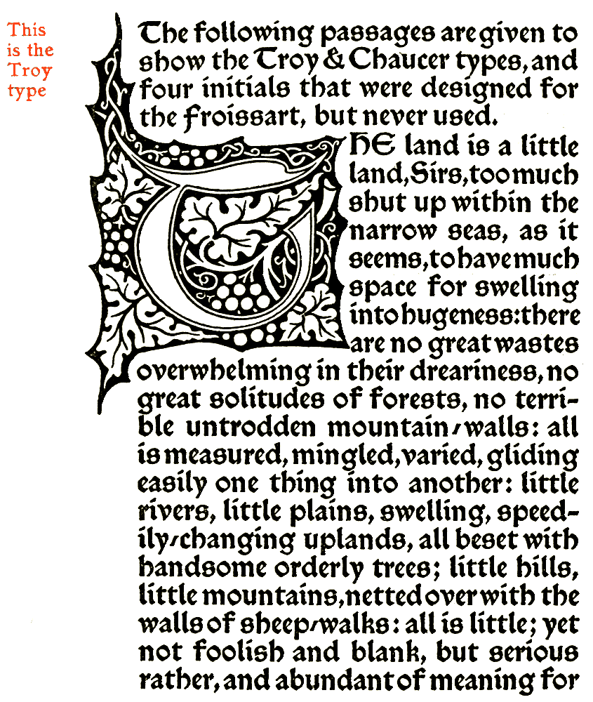 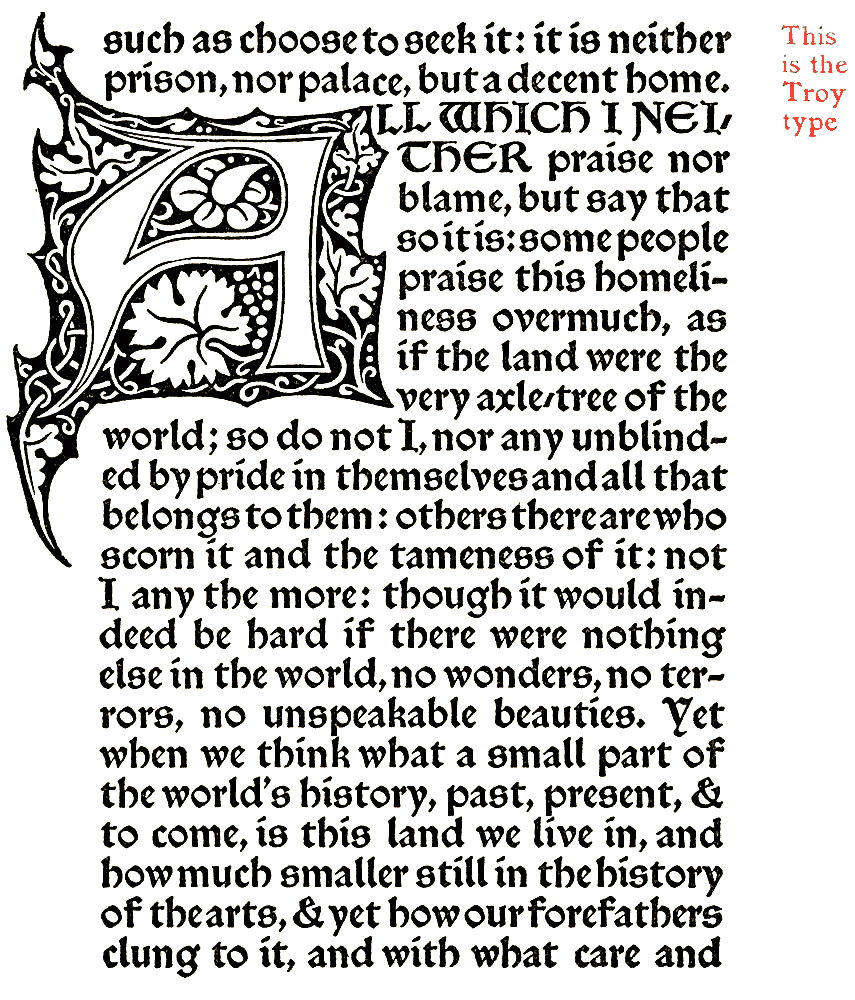 
The "Note by
William Morris on his Aims in Founding the Kelmscott
Press," the last book printed at the Kelmscott Press, contains a few
errors in the "Bibliography." These errors have been allowed to stand
in reprinting the "Note" here, in order that the reprint shall be a
literal one. Mr. S. C. Cockerell, the former Secretary of the Kelmscott
Press,
has kindly sent a list of these corrections, which appear below: Page
19, line
21--"Golden type" should be inserted after "8vo." Page 30,
line 16--"June 26, 1893," should be "June 26, 1896." Page
39, line 17--after "guineas" insert "ten on vellum at ten
guineas." Page 40, line 31--for "eight leaflets" read,
"nine or ten leaflets." Page 44, line 12--omit "Lady." |
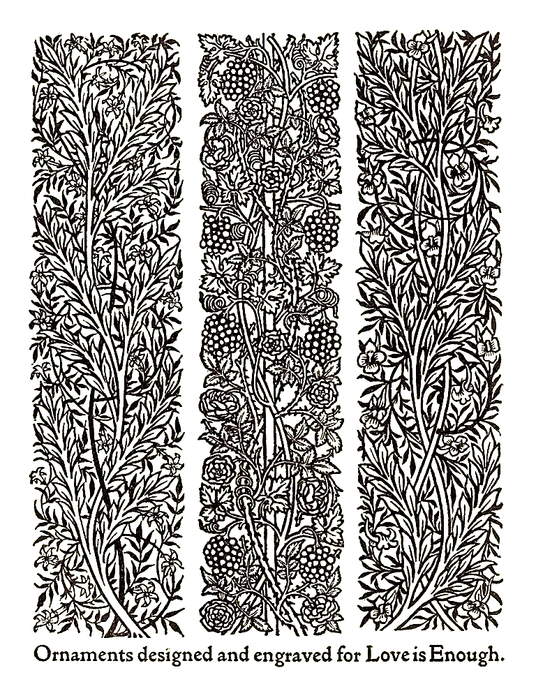

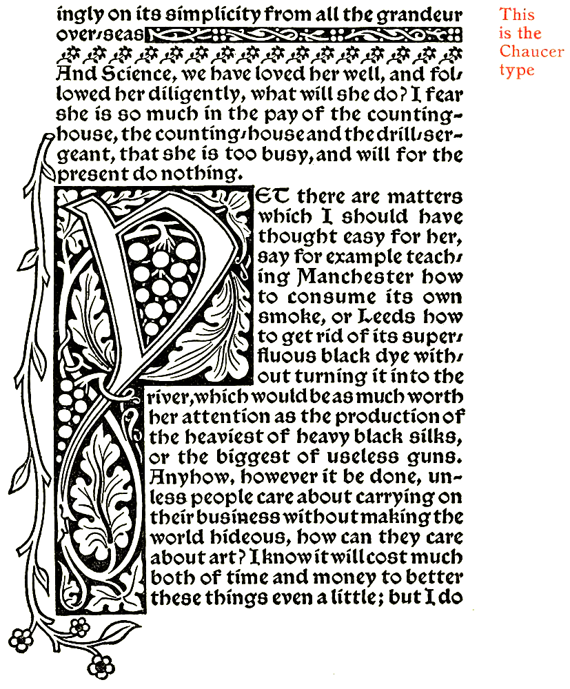
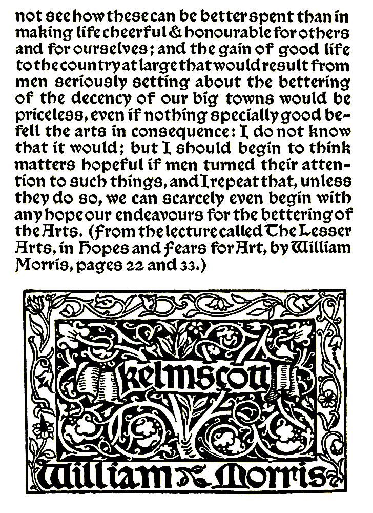
Web and Book design,
Copyright, Kellscraft Studio
1999-2016
(Return to Web Text-ures)